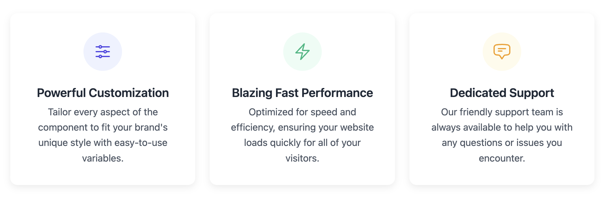
Icon & Title & Description Card
Effectively highlight key features or services using a combination of a clear icon, a bold title, and a supporting description.
This layout is a popular choice for homepages and landing pages where you need to quickly communicate value propositions to your users.
About this Component
This component uses an "icon-on-top" pattern to create a strong visual anchor for each point you want to make. It's an excellent way to break down complex ideas into digestible, visually separated chunks. This template comes with a responsive grid container and uses inline svg for the icons, making them lightweight and easy to style.
Features
- Inline SVG Icons: No external libraries are needed. The icons are part of the HTML, which means they load fast and can be styled with CSS.
- Responsive Grid: The flexible grid container automatically adjusts the layout for different screen sizes, from a single column on mobile to multiple columns on desktop.
- Easy Color Theming: Icon and background colors are controlled by CSS variables (e.g.,
--itd-icon-color), making it simple to create different color variations or match your brand. The example shows how to do this with optional modifier classes like.style-2. - Hover Animation: A clean and professional hover effect provides users with satisfying interactive feedback.
Code Breakdown
HTML Structure
Each card is a simple div with the class .itd-card. Inside, another div with the class .itd-card-icon acts as a circular colored background for the icon itself. The icon is an inline svg element. Below the icon, a standard h3 and p tag structure the text content. While it's common practice to make cards clickable, the cards provided here are typically not used as links themselves, but rather as visual displays of information.
CSS Styling
The .itd-card uses text-align: center to center all of its content. The icon's colored circle is created by giving the .itd-card-icon container a specific width, height, and a border-radius of 50%. The svg within it can be styled using the CSS color property, which controls the stroke or fill of the SVG when they are set to currentColor in the HTML. The colors are defined using CSS variables for easy customization. The optional classes (.style-2 and .style-3) simply override these variables to demonstrate theming possibilities.
Code
Here is the complete code. You can easily add more cards by duplicating one of the .itd-card blocks. To use your own icons, simply paste new svg code in place of the examples.