Event Summary Card
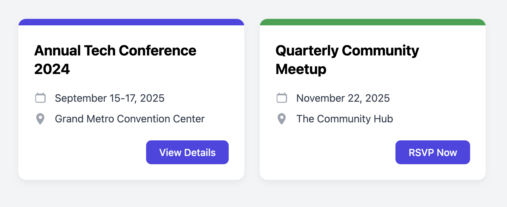
Clearly present upcoming events and allow users to see key information at a glance with this clean event summary card.
This layout is ideal for an events page, a conference schedule, or a community calendar. It highlights the title, date, and location in a scannable format and includes a clear call-to-action.
About this Component
This card design uses a simple color banner at the top to add a splash of visual interest and help categorize events if needed. The core information is presented in a list format, each item paired with a relevant icon for quick visual recognition. A prominent call-to-action button in the footer encourages user interaction.
Features
- Scannable Info List: The date and location are presented in an icon-and-text list, which is easy for users to parse quickly.
- Color Banner: A simple top border allows for easy visual theming or categorization using modifier classes (e.g.,
.style-2). - Semantic Structure: The info list uses a semantic unordered list (
ul) and the date uses thetimeelement for better machine-readability. - Responsive and Flexible: The card uses Flexbox to ensure the footer always aligns to the bottom, and it sits within a standard responsive grid container.
Code Breakdown
HTML Structure
The card is an article. A div with the class .event-card-banner creates the top color bar. The main content area contains a link-wrapped h3 title, a ul for the list of event details, and a footer div with the call-to-action link.
CSS Styling
The card's main content area (.event-card-content) is a flex container with flex-direction: column. Inside it, the info list (.event-card-info-list) is given flex-grow: 1. This is important for the layout, as it makes the list expand to fill any available vertical space, which neatly pushes the footer to the bottom of the card, ensuring a consistent alignment across cards of different heights.
Code
Here's the complete, self-contained code. You can easily add more event detail items to the list or create new color banner variations by adding more modifier classes.