Webinar/Online Meeting Card with Join Button
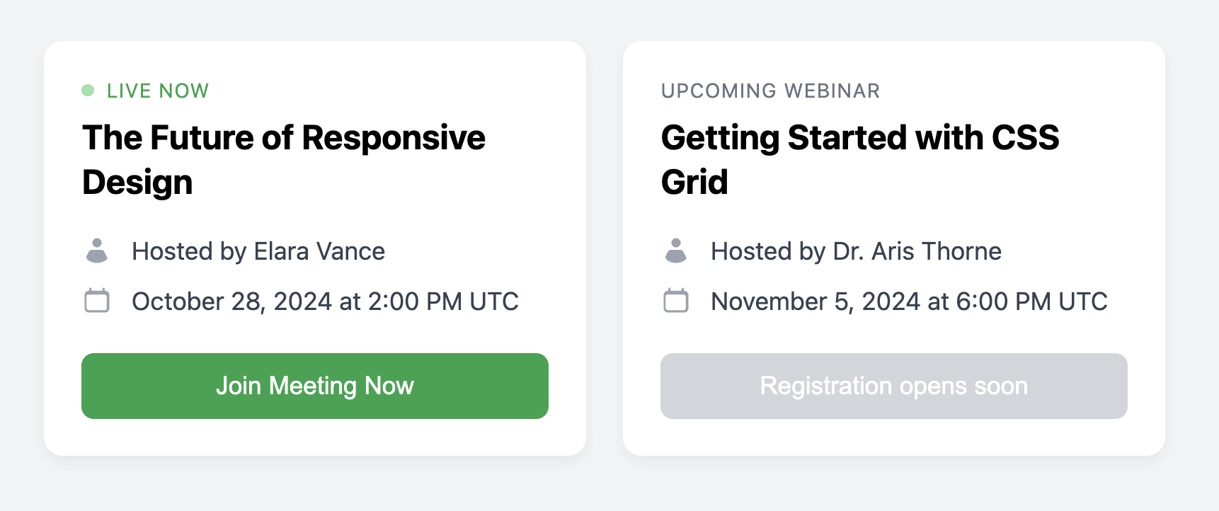
Promote your virtual events with this professional card, designed to feature key information and a clear call-to-action.
This template is ideal for listing webinars, online workshops, or team meetings. It includes styles for different event states, such as a prominent "Live Now" indicator to attract immediate attention.
About this Component
This component provides a clear structure for communicating the essential details of an online event. The example demonstrates how to use a modifier class to visually change the card's state for a live event, making the call-to-action button more prominent and adding an animated status indicator.
Features
- "Live" State Styling: Use the
.is-livemodifier class to instantly change the card's appearance for an event that is currently in progress. - Pulsing Indicator: The "live" state includes a subtle, animated pulsing dot created with CSS
@keyframesto draw the user's eye. - Disabled State: Shows how to use the
:disabledpseudo-class to style the button for upcoming events where the call-to-action is not yet available. - Iconography: Uses clear icons to label key details like the event host and time, improving scannability.
Code Breakdown
HTML Structure
Each card is a semantic article. To indicate a live event, you add the .is-live class to this main element. The content is structured with a header for the title, a ul for the list of details, and a footer for the action button. The pulsing "live" dot is simply an empty span that is styled by the CSS.
CSS Styling
The layout is managed with Flexbox. The main card uses flex-direction: column, and the detail list (.webinar-card-details) has flex-grow: 1, which pushes the footer to the bottom for consistent alignment. The "Live" indicator's pulsing effect is created with an @keyframes rule named pulse that animates the element's opacity. All state-specific styles, like the green colors and the animated dot, are scoped under the .is-live modifier class.
Code
Here is the complete, self-contained code. Toggle the live state by adding or removing the .is-live class from the main card element.