Notification Card
Communicate important information, status updates, or alerts to your users with this clear and accessible notification card.
This component is essential for any application or dashboard. It's designed to be easily adapted to different contexts, with pre-styled variations for information, success, warnings, and errors.
About this Component
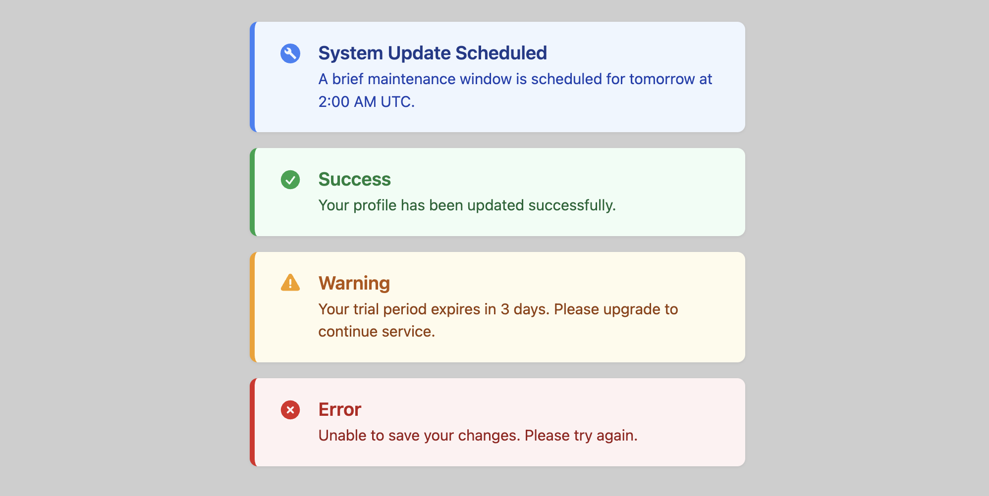
This template uses a classic alert message pattern. An icon and a colored left border provide a strong visual cue for the notification's type, while the main content area provides a title and a descriptive message. The component's appearance is controlled entirely by a single modifier class.
Features
- Contextual Color Theming: The template includes four pre-built themes. These are "info" (blue), "success" (green), "warning" (amber), and "danger" (red).
- Modifier-Based Styling: Easily change a notification's style by adding a single class (e.g.,
.is-success) to the main card element. - Themed with CSS Variables: Colors for each theme are set with CSS variables, making it simple to customize to your brand's palette.
- Accessible: Each notification is a distinct region with an icon that visually supports the message's intent.
Code Breakdown
HTML Structure
Each notification is a simple div with the class .notification-card. You can then add a modifier class like .is-warning to apply a different style. Inside, the card is a flex container with a div element for the icon and a div for the text content. The text content includes an h3 element for the title and a p element for the message.
CSS Styling
The core styling uses a colored border-left and a light, tinted background-color to define the notification's look. This is all handled by the --notification-accent-color and --notification-bg-color variables. The modifier classes (e.g., .is-success) work by simply re-declaring these variables with different color values. The text colors inside the notification are then set based on these accent colors for a cohesive theme.
Code
Here is the complete, self-contained code. Simply choose the notification style you need and apply the corresponding class to the card element.