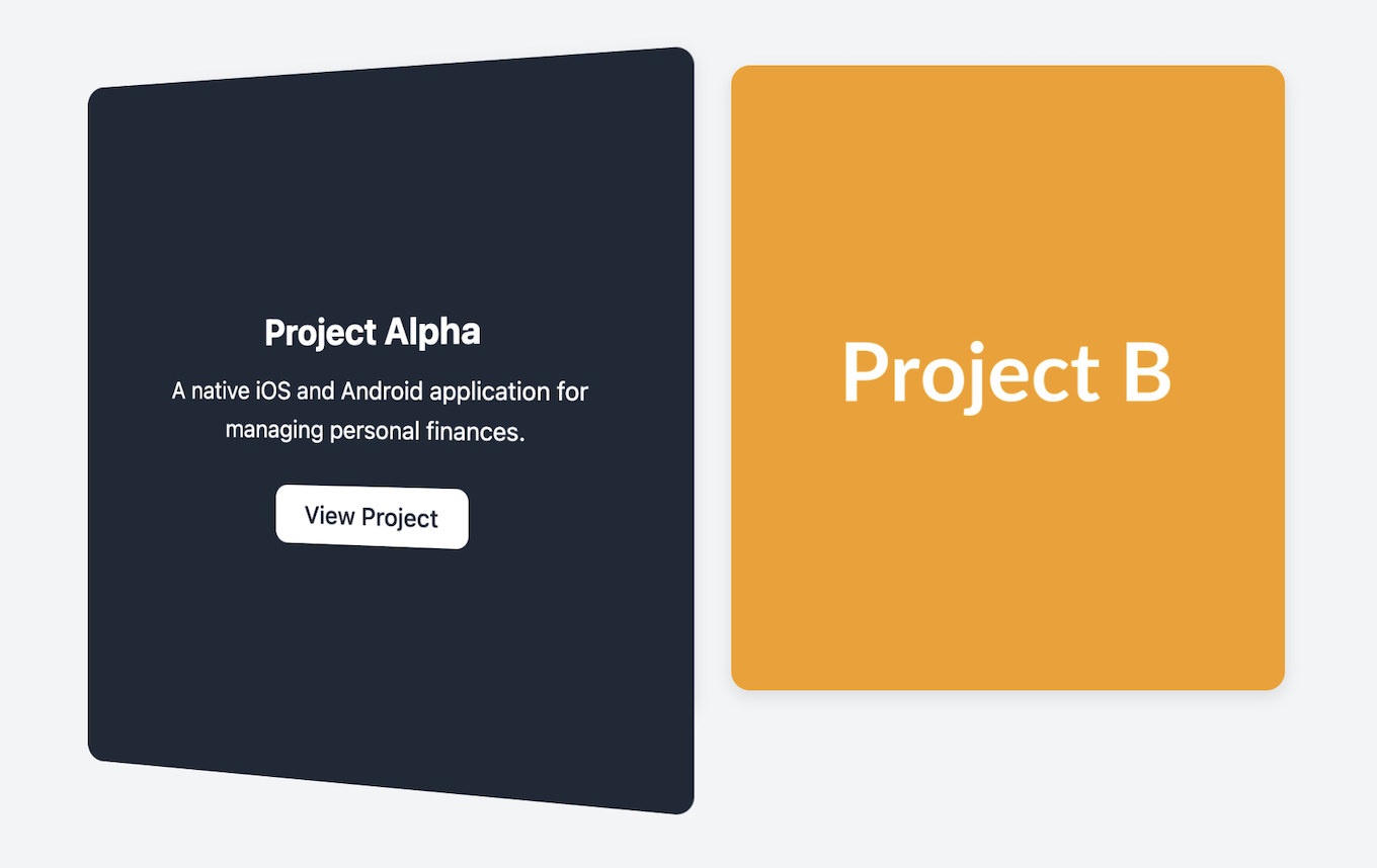
Flip Card (Front/Back)
Create a memorable and engaging user experience with this interactive card that flips over on hover to reveal content on its back side.
This high-impact effect is perfect for portfolios, Q&A sections, or any scenario where you want to add a layer of discovery. The front can display an image or question, while the back reveals details and a call-to-action.
About this Component
This is a CSS-only component that uses 3D transforms to create a realistic flipping animation. By nesting a few simple elements, we can create two distinct "faces" for the card and use a hover state to trigger the rotation.
Features
- CSS 3D Flip Effect: A smooth, hardware-accelerated 3D rotation is handled entirely by CSS, requiring no JavaScript.
- Two-Sided Card: Provides a clear front and back structure, perfect for showing an image first, then revealing details on hover.
- Engaging Interaction: Encourages user discovery by hiding secondary information on the back of the card until the user interacts with it.
Code Breakdown
HTML Structure
The card requires three nested div elements. The outermost div class="flip-card" creates the 3D space. The middle div (.flip-card-inner) is the element that actually performs the flip animation. Finally, two child divs (.flip-card-front and .flip-card-back) represent the two faces of the card.
CSS Styling
The 3D flip effect relies on a few core CSS properties:
perspective: Applied to the static outer container, this property gives child elements a 3D space to transform within.transform-style: preserve-3d: Applied to the inner element that rotates, this tells its children (the front and back faces) to exist in that 3D space.transform: rotateY(180deg): On hover, this is applied to the.flip-card-innerto create the flip animation. The back face,.flip-card-back, is also given this transform by default so that it starts off facing away from the user.backface-visibility: hidden: Applied to both front and back faces, this property makes the reverse side of an element invisible, preventing a mirrored version of the front from showing through when the card is flipped.
Code
Here's the complete, self-contained code. Simply update the image on the front and the text content on the back to build your interactive component.