User Comment Card
Display user comments in a clean, indented format perfect for building discussion threads and online conversations.
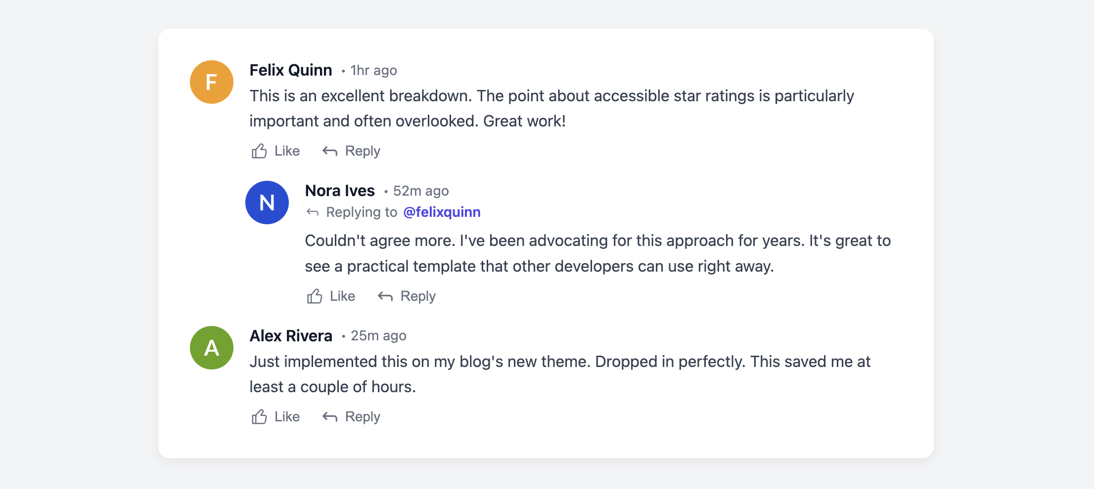
This layout is perfect for blogs and forums. It combines a user avatar with their name, a timestamp, comment text, and action buttons. The template is structured to handle nested replies gracefully.
About this Component
A clear comment layout is vital for fostering community discussion. This template provides a robust structure for displaying a thread of comments, including parent-level comments and their indented replies. The component prevents infinitely-nested threads which can break layouts on smaller devices and makes conversations easier to follow.
Features
- Logical Threading: The HTML is structured to group a parent comment with its replies. CSS handles a single level of indentation to maintain readability and prevent layout issues.
- Reply Context: A "Replying to @username" element is included to ensure the conversation's flow is always clear, even if the original comment has scrolled out of view.
- Semantic Time Element: The timestamp uses the HTML
timeelement with a machine-readabledatetimeattribute. - Action Buttons: A footer provides users with clear action buttons for engagement.
Code Breakdown
HTML Structure
This template uses a nested structure to create threads. Each parent comment and its direct replies are wrapped in a div with the class .uc-card-wrapper. Inside, the parent comment is a standard article. All of its replies are grouped in a separate div with the class .uc-card-replies. For clarity, a reply includes a .uc-card-reply-context element, which explicitly states who the user is replying to.
CSS Styling
Each individual comment (.uc-card) is a flex container, aligning the avatar and the text content side-by-side. The indentation for replies is handled by applying a margin-left to the .uc-card-replies container. This indents the entire block of replies at once. This method prevents layouts from breaking on mobile devices by limiting the nesting depth to a single visual level, as any further replies to replies would simply appear within this same indented block, distinguished by their "Replying To" context.
Code
Here's the complete code. You can build out threads by creating new .uc-card-wrapper blocks for each new top-level comment, and by adding reply article elements inside the .uc-card-replies container.