Product Card
Display your products in a clean, attractive, and effective grid with this standard e-commerce product card.
This component is essential for any online store's category or search results pages. It provides all the necessary information at a glance and a clear call-to-action (CTA) to drive sales.
About this Component
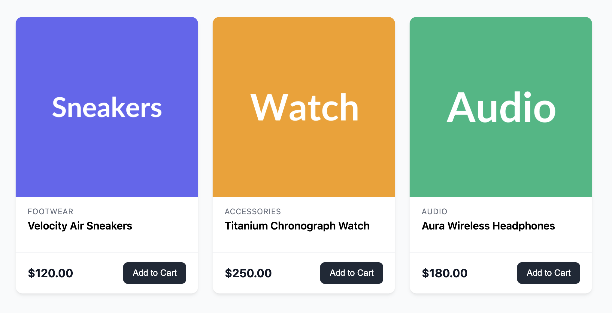
The structure of this card is carefully considered for usability. The product image and title are wrapped in a single link, allowing users to easily click through for more details. The "Add to Cart" button is a separate interactive element, which is a common and accessible e-commerce pattern.
Features
- Conversion-focused: Separates the link to the product details page from the "Add to Cart" button, allowing for two distinct user actions.
- Clear Information Hierarchy: The category, title, and price are styled to be easily scannable by the user.
- Flexible Layout: The card's body uses Flexbox to push the footer section (with price and CTA) to the bottom, ensuring all cards in a row have a consistent and aligned appearance.
- Responsive Grid: The template includes the standard responsive grid container for displaying your products.
Code Breakdown
HTML Structure
Each card is an article with the class .product-card. A single anchor (a) tag wraps the product's image and main content block. This makes a large portion of the card clickable, leading the user to the product detail page. The final part of the card is a footer element, which sits outside of the main link. This footer contains the price and the "Add to Cart" button, treating it as a separate action.
CSS Styling
The card itself is a flex container with flex-direction: column. The main content area (.product-card-content) has flex-grow: 1, which is an important detail. It allows this section to expand vertically, taking up any available space and pushing the footer to the bottom. This ensures a uniform look for cards in the same row, even if product titles have different line counts. The footer is also a flex container, using justify-content: space-between to position the price on the left and the button on the right.
Code
Here's the complete, self-contained code for the product card. You can easily populate a shop page by duplicating the article block within the grid container for each of your products.