Text-only Card
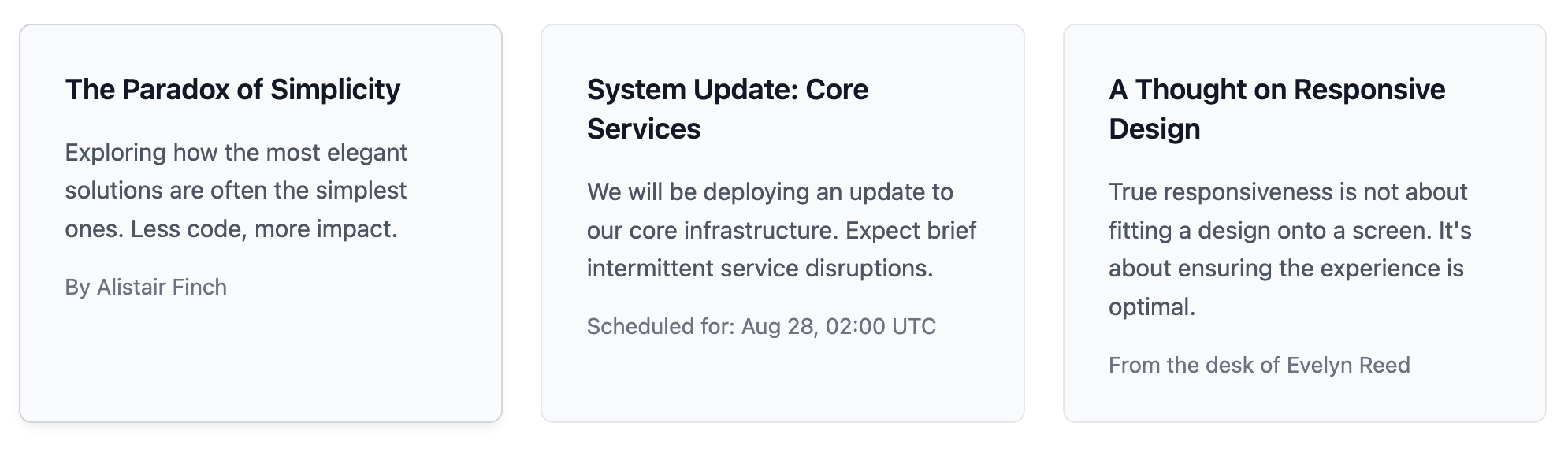
A minimalist card template that puts the focus squarely on your written content through clean typography.
This component is ideal for when you need to present information without the distraction of images or icons, making it perfect for announcements, thoughts, or text-based links.
About this Component
This template provides a simple yet elegant solution for presenting text in a card format. It uses clean lines, ample whitespace, and clear typographic hierarchy to ensure content is legible and looks professional. The code includes a responsive grid container for displaying multiple text cards.
Features
- Responsive Grid: Built with a CSS Grid wrapper that seamlessly arranges cards in columns and rows depending on the available screen space.
- Minimalist Design: The clean aesthetic ensures that your text is the center of attention.
- Scoped CSS: Styles for the grid (
.cards-grid-container) and the card (.to-card-container) are self-contained to avoid interfering with your website's existing stylesheets. - Hover Effect: A subtle border and shadow effect on hover provides visual feedback that the card is a clickable element.
Code Breakdown
HTML Structure
A primary div with the class .cards-grid-container acts as the flexible grid for the cards. Each card is an article element. The entirety of the card's content is wrapped in an anchor (a) tag to make it a single, clickable unit. Inside, the content hierarchy is defined with a h3 for the title, a p for the main description, and a final paragraph with the class .to-card-meta for secondary information like an author or date.
CSS Styling
The style of the .to-card-container is deliberately simple. It relies on a light background-color, a soft border, and generous padding to create separation and a clean look. The font-size and font-weight properties are used to create a clear visual distinction between the title, description, and metadata. CSS variables like --to-card-padding and --to-card-bg-color are defined at the top of the style rule, making it simple to customize the card's appearance.
Code
Here is the complete code. Simply copy and paste the sections into your project. You can add more cards by duplicating the article block within the grid container.