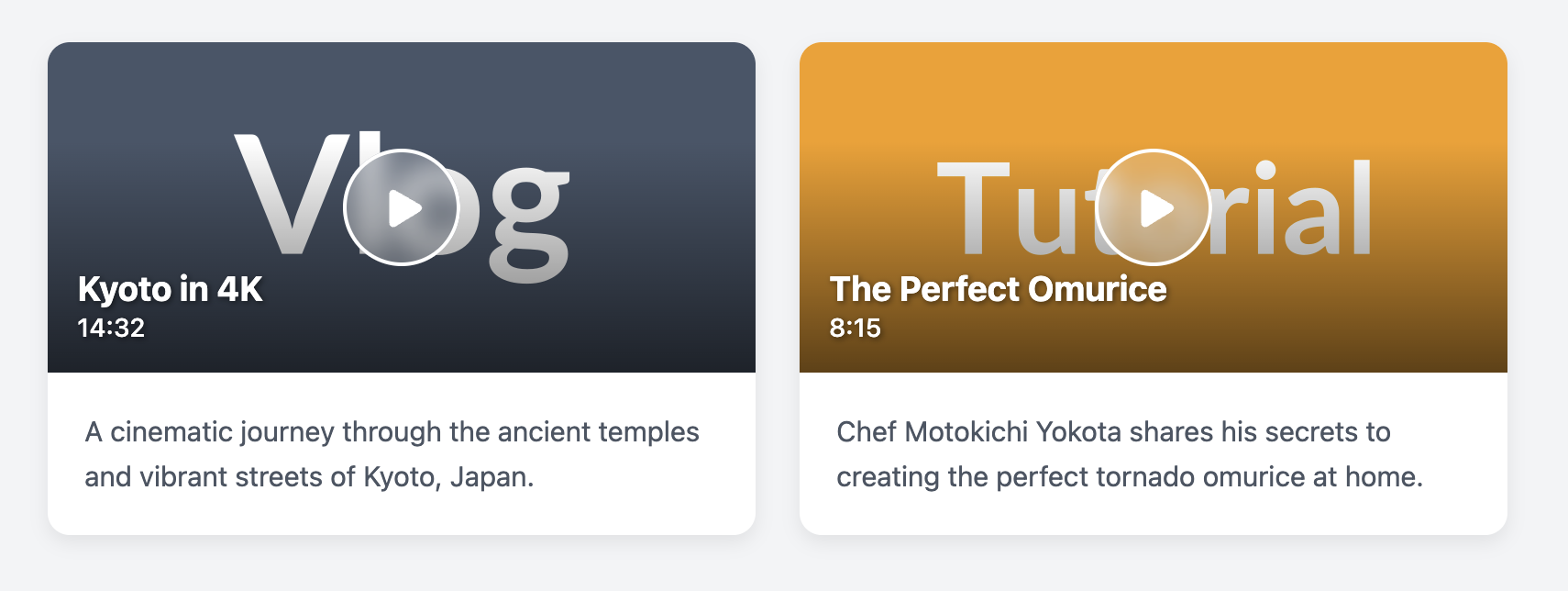
Video Preview Card with Play Button
Showcase your video content and encourage plays with this dynamic and visually engaging preview card.
This component is a must-have for any site featuring video, such as vlogs, tutorials, or course platforms. It combines a large video thumbnail with an overlaid title, duration, and a prominent "play" icon to maximize user engagement.
About this Component
This card is designed to look like a modern video player interface. The video's title and duration are overlaid on the bottom of the thumbnail, using a gradient to ensure readability. The most prominent feature is the large, centrally-located play button, which invites the user to click. A subtle zoom effect on the thumbnail on hover adds a polished interactive feel.
Features
- Clear Visual Hierarchy: The central play button is the primary focal point, making the card's purpose immediately clear.
- Info Overlay: Title and duration are displayed on a gradient overlay, a common pattern in modern video platforms that maximizes thumbnail space.
- Hover Effects: A subtle zoom on the thumbnail and a growing effect on the play button provide rich visual feedback to the user.
- Accessible: The card is a single, large, clickable link. The play button is marked with
aria-hidden="true"as it's a decorative element supporting the main link.
Code Breakdown
HTML Structure
The card is an article. The main interactive element is a single a tag that wraps both the thumbnail container and the description below. Inside the thumbnail-container, we have the img, the play button div, and another div for the overlaid text info.
CSS Styling
The layout of the overlay is achieved with CSS absolute positioning. The .video-card-thumbnail-container has position: relative, which acts as the positioning context. The play button and the text overlay are then positioned absolutely within it. The play button is centered perfectly using top: 50%, left: 50%, and transform: translate(-50%, -50%). A CSS ::before pseudo-element on the container creates the gradient effect for the text overlay.
Code
Here's the complete, self-contained code. Simply update the thumbnail image, title, and description for your videos.