Blog Series Card with Part Numbers
Organize multi-part articles and guide your readers through a content series with this specially designed card.
This layout is perfect for tutorials, deep-dives, or any content that's broken into multiple installments. The prominent part number makes it easy for users to identify where they are in the series and which post to read next.
About this Component
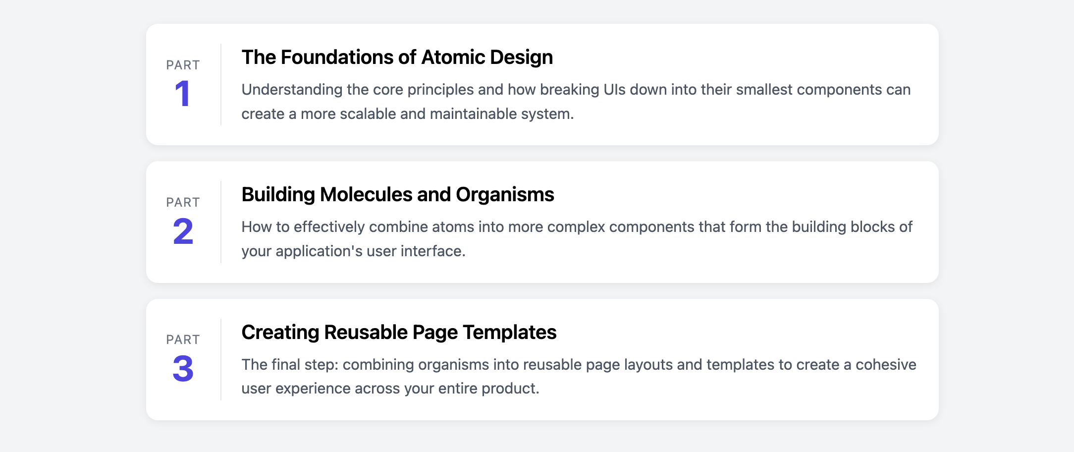
The card features a distinct two-column layout. The left column is dedicated entirely to the part number, making it the primary visual anchor. The right column contains the article's title and a short excerpt. The entire card is clickable and fully responsive, stacking into a single column on smaller screens for readability.
Features
- Prominent Part Number: A dedicated column with a large number makes the sequence clear and scannable.
- Clean Separation: A subtle vertical border visually divides the part number from the article content on larger screens.
- Responsive Stacking: The layout intelligently switches from a horizontal two-column view to a vertical stack on mobile, preserving the logical flow of information.
- Line-Clamp for Text: Includes an optional CSS technique to truncate the article excerpt to a set number of lines, helping to maintain a uniform and tidy list.
Code Breakdown
HTML Structure
The entire card is an article with a single clickable a tag wrapping the content. The direct children of the link are two div elements that form the columns (.series-card-part-col for the number and .series-card-details-col for the text).
CSS Styling
The main clickable link (.series-card-link) is styled with display: flex and align-items: center. This creates the two-column layout and vertically centers the content of both columns with each other. A border-left on the details column creates the subtle dividing line. On screens narrower than 500px, a media query changes the flex-direction to column, stacking the part number block on top of the details block.
Code
Here's the complete, self-contained code. It's ready to be used to list the articles in your content series.