User Role Management Card
Efficiently manage user permissions and roles with this functional and clear interface card.
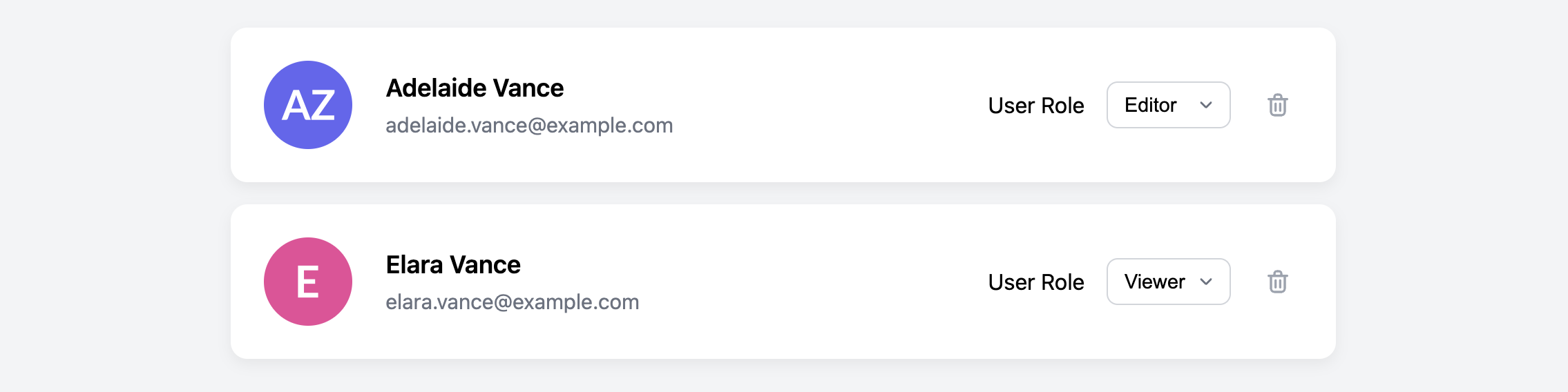
This is a core component for the "Users" or "Team Members" section of any admin panel. It displays basic user information (avatar, name, and email) alongside interactive controls for changing their role via a dropdown menu and removing them from the system.
About this Component
The card is designed to present a single user within a list. Its most notable feature is the custom-styled dropdown (select) menu, which provides a consistent appearance across all browsers while remaining fully accessible and functional. The component is responsive, stacking neatly on smaller screens.
Features
- Custom-Styled Select Menu: Provides a consistent dropdown appearance across browsers, overriding the default operating system styles.
- Accessible Forms: Uses a semantic
label(though visually hidden) for theselectelement to ensure it's accessible to screen readers. - Responsive Layout: The multi-column layout on desktop cleanly transitions to a stacked format on mobile to preserve readability and usability.
Code Breakdown
HTML Structure
Each card is an article. The card is a flex container, with the main columns being a user avatar img, a div for the user details, and another div for the form controls. The role selection uses a native select element with its options. An important accessibility feature is the label with a for attribute pointing to the id of the select menu. The label is visually hidden but available to screen readers.
CSS Styling
Creating a custom-styled dropdown requires a specific technique. We first remove the default browser styling from the select element by using appearance: none. This removes the default dropdown arrow. We then add our own custom arrow by setting a background-image property on the select element, using an inlined SVG for the arrow graphic. We also adjust the padding-right on the select to make sure the text doesn't run underneath our custom arrow. The rest of the card is a straightforward Flexbox layout that switches flex-direction in a media query for smaller screens.
Code
Here's the complete code. In a live application, changes to the select menu would typically be submitted via JavaScript or a form submit button to update the user's role on the server.