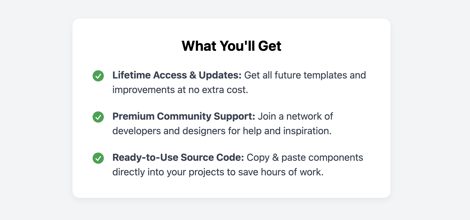
Benefit Card with Checkmarks
Clearly list the major benefits of a product, service, or membership with this simple and effective card component.
This layout is designed to be a single, focused element on a page, helping you to quickly summarize value propositions and build customer confidence.

About this Component
The benefit card uses a clean, list-based format where each benefit is accompanied by a positive checkmark icon. It starts with a bold title and then presents the list in a highly readable, single-column layout, making it easy for users to scan the most important selling points.
Features
- Benefit-Oriented Design: Each list item is prefixed with a colored checkmark to visually reinforce a positive outcome.
- Clear Typography: A strong title and an easy-to-read list with bolded lead-in text make the content highly scannable.
- Self-Contained Module: This card is a single, self-contained component that works well on its own within a section of a landing or sales page.
- CSS Theming: The color of the checkmark icons is controlled by a single CSS variable (
--check-icon-color) for easy customization.
Code Breakdown
HTML Structure
The card is a single article. The structure is simple and semantic, containing a h3 for the main title and an unordered list (ul) for the benefits. Each list item (li) contains the SVG icon and a span for the text. Using a strong tag for the first few words of a benefit helps it stand out.
CSS Styling
Each list item (.benefit-item) is styled as a flex container with display: flex and align-items: flex-start. This ensures the checkmark icon and the multi-line text next to it remain properly aligned at the top. A gap is used for consistent spacing between the icon and the text. The rest of the styling focuses on clean typography and spacing to maximize readability.
Code
Here's the complete, self-contained code. It's ready to be used as a component on any page where you need to list out the value propositions of your offer.