Activity Summary Card
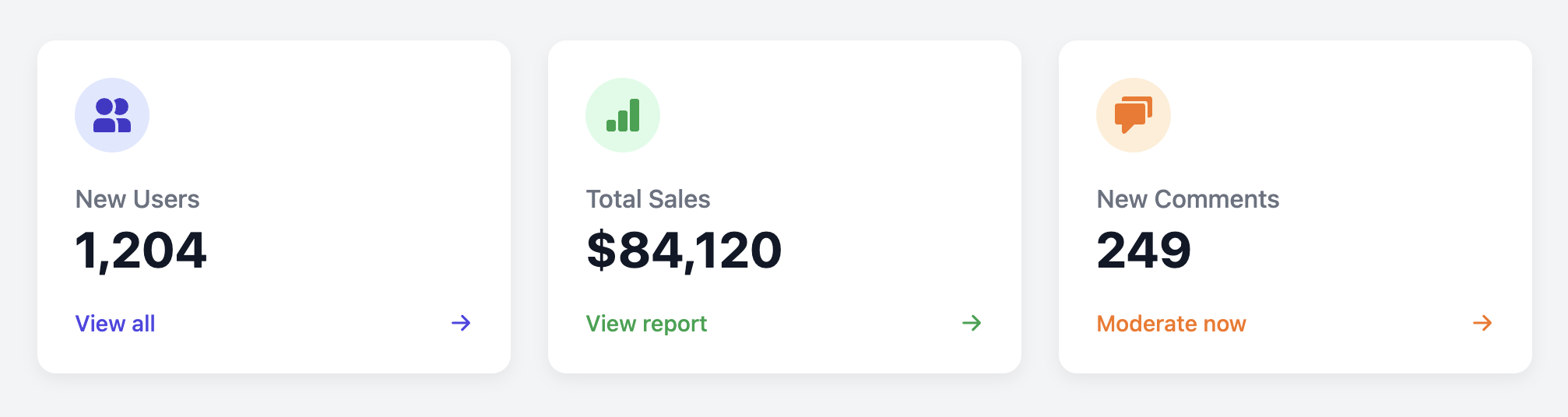
Provide a high-level, clickable summary of key application metrics with this classic dashboard card.
This component is a fundamental part of any admin dashboard. It's designed to give administrators a quick link to important sections of the site (like users, sales, or comments) while also showing a snapshot of recent activity.
About this Component
The entire card is designed as a single clickable link to improve usability. The design uses a colored icon, a prominent figure for the main statistic, a clear label, and a "View all" link in the footer to guide the user. The card can be easily themed for different types of content using simple modifier classes.
Features
- Clickable Card: The entire card is a single, large link, making it an easy target for users to click to navigate to a detailed view.
- Themed Icons: The background and icon colors can be easily customized with CSS variables. The template includes modifier classes to demonstrate this for different metrics.
- Aligned Footer: Flexbox is used to ensure the footer always aligns neatly to the bottom, creating a uniform look for all cards in a grid.
Code Breakdown
HTML Structure
The entire card is an anchor (a) with a class of .asc-card-link which serves as both the card container and the main link. To add a different color theme, you add a modifier class (e.g., style-sales) to this a tag. Inside, a div holds the icon, another div holds the main text content, and a footer contains the call-to-action text.
CSS Styling
The main card is a flex container with flex-direction: column. We have flex-grow: 1 on the .asc-content div makes that section expand to fill all available vertical space. This pushes the footer to the bottom of the card, ensuring consistent alignment in a grid. The color themes are handled by two CSS variables: --asc-icon-bg and --asc-icon-color. The modifier classes, like .style-sales, simply override these variables to apply new colors to the icon and its background.
Code
Here's the complete, self-contained code. It's ready to be used to build a dynamic and informative admin dashboard.