User Activity Feed Card
Display a stream of recent user activities or notifications with this versatile and readable feed card template.
This layout is designed to be used as an item within a list. It's ideal for dashboards and profile pages, showing a mix of different actions such as new followers, content uploads, or comments.
About this Component
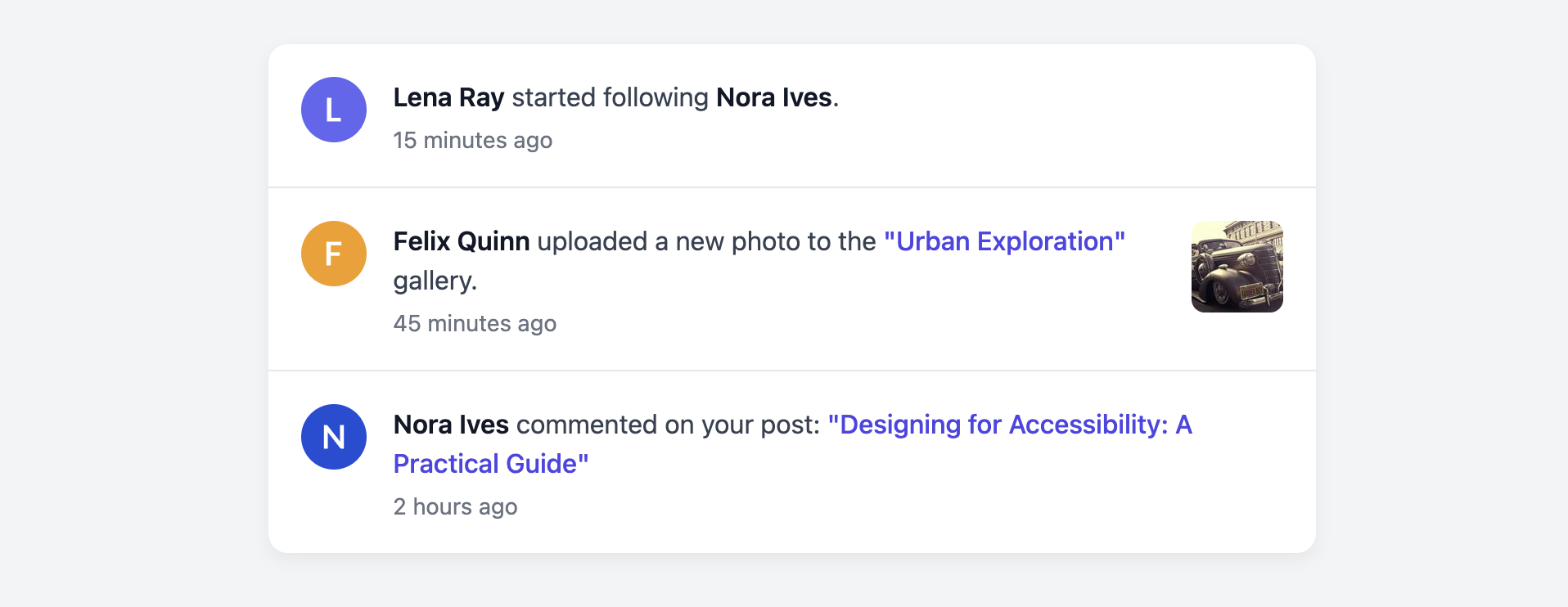
This template is built to be flexible. It accommodates different types of notifications in a single, consistent style. Some feed items may be simple text updates, while others might include a relevant thumbnail for context, such as a preview of an uploaded photo. The entire component is built using a semantic list structure.
Features
- Flexible Structure: Easily adapts to different types of activities, with or without a contextual element like a thumbnail.
- Semantic List: The feed is built with an unordered list (
ulandli), which is the correct semantic structure for a list of items. - Clear Typography: A strong typographic hierarchy makes it easy to distinguish user names, actions, and timestamps.
- Responsive Layout: The Flexbox-based layout is inherently responsive and works well across all screen sizes.
Code Breakdown
HTML Structure
The entire feed is contained in a ul element, with each activity item being a li. Inside each list item is a semantic article tag with the class .uaf-card. This card is a flex container holding three potential children: an avatar image, a main content block (.uaf-card-main), and an optional context block (.uaf-card-context) for thumbnails. Important text like usernames is emphasized with the strong tag.
CSS Styling
The main alignment is handled by applying display: flex to the .uaf-card. The main text content area (.uaf-card-main) is set to flex-grow: 1, which allows it to take up any available space in the middle, pushing the optional context block to the far right. The avatar and context thumbnail are given a flex-shrink: 0 property to prevent them from being compressed on smaller screens. A simple bottom border on the list items creates a clean visual separation between each activity.
Code
Here is the complete code. You can easily adapt it by mixing and matching the different activity formats shown in the example, or by creating your own variations.