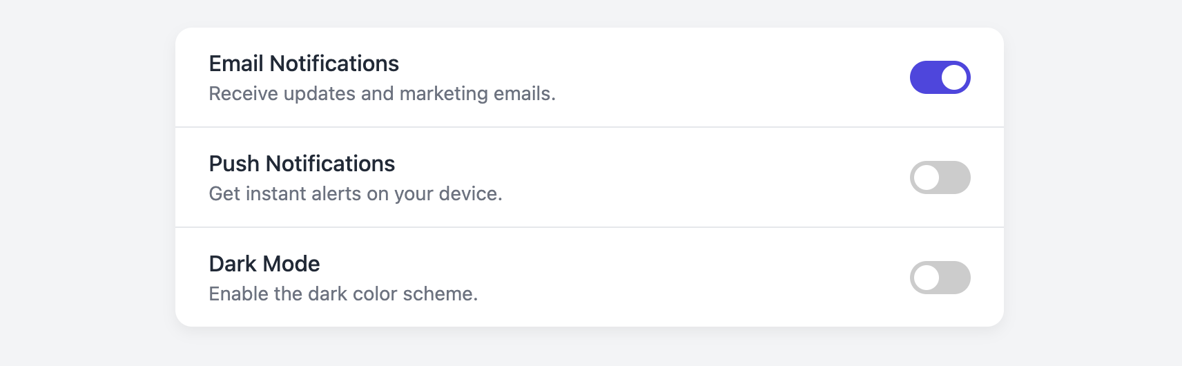
Settings Toggle Card
Provide users with clear, binary choices for application settings or preferences with this stylish toggle switch card.
This is an ideal component for any settings page. It presents an option with a title and description, and uses an accessible, animated switch to control its on/off state, all without requiring any JavaScript.
About this Component
The core of this component is a visually styled toggle switch that is built using only HTML and CSS. It's an enhancement of a standard checkbox input, making it more intuitive and visually pleasing. The component is fully accessible to keyboard and screen reader users.
Features
- CSS-Only Toggle Switch: The interactive on/off switch is built from a standard checkbox and styled with CSS, requiring zero JavaScript to function.
- Accessible by Design: By using a semantic
labeland a hiddeninput type="checkbox", the toggle is fully accessible and keyboard-navigable. - Focus State: The toggle includes a clear focus ring, ensuring keyboard users can easily see which element is active.
- List-Ready: The card is designed as a list, making it simple to stack multiple settings options on a single page.
Code Breakdown
HTML Structure
Each setting is a div with the class .stc-card. A label for the title is explicitly linked to the id of its corresponding input. The toggle switch itself is a second label wrapping a visually-hidden input type="checkbox" and a span element which acts as the visual part of the switch (the slider).
CSS Styling
The toggle switch's functionality lies in the use of the :checked pseudo-class and the adjacent sibling selector (+). The input itself is hidden with opacity: 0. The visual element (.stc-toggle-slider) is styled to look like a switch. When the input is checked (input:checked + .stc-toggle-slider), the CSS changes the background color of the slider. The sliding circle is a pseudo-element (::before) on the slider. When the input is checked, its transform: translateX(20px) property is animated, creating the smooth sliding effect.
Code
Here is the complete code. You can easily build a settings page by duplicating the li element for each option you need to provide.