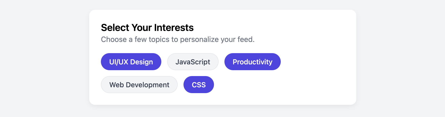
Tag Selector Card
Allow users to select multiple options in an intuitive and visually appealing way with this tag selector card.
This is a highly versatile component for any onboarding flow, preferences page, or filtering system. It presents options as clickable "tags" or "pills" that toggle their state on click, all powered by CSS.
About this Component
The core of this card's functionality is a clever use of native HTML checkboxes, which are visually hidden and replaced by styled label elements. This CSS-only approach provides a modern, interactive feel without the need for JavaScript, while remaining fully accessible to both keyboard and screen reader users.
Features
- CSS-Only Interactivity: The toggle selection is handled entirely with the
:checkedpseudo-class in CSS. No JavaScript is required. - Fully Accessible: By using a semantic
labelfor each hiddeninput type="checkbox", the component is keyboard-navigable and works perfectly with screen readers. - Flexible Layout: The container for the tags uses Flexbox with wrapping enabled, allowing the tags to flow naturally onto multiple lines.
Code Breakdown
HTML Structure
Each selectable tag is a div that contains an input with type="checkbox" and a corresponding label. The input is visually hidden via CSS but remains functional. The label is styled to look like a clickable "pill" or tag. The label's for attribute must match the input's id to create the link that allows clicking the label to check and uncheck the hidden input.
CSS Styling
The interactivity is powered by the adjacent sibling selector (+) and the :checked pseudo-class. The rule .tag-input:checked + .tag-item is the important part. It basically says "When a tag-input checkbox is checked, select the adjacent tag-item (our label) and apply these new styles to it". This allows us to change the background-color, color, and border-color of the label when its associated checkbox is selected. We also provide a visible focus style with the :focus-visible pseudo-class for keyboard users.
Code
Here's the complete, self-contained code. You can easily add more options by duplicating the tag structure in the HTML. To make a tag selected by default, just add the checked attribute to its input element.