User Check-in Card
Display user "check-ins" at various locations in a format similar to popular social and travel applications.
This card is designed to showcase the user being at a particular place. It combines the user's identity with the location details, and optionally supports a map or photo of the checked-in venue.
About this Component
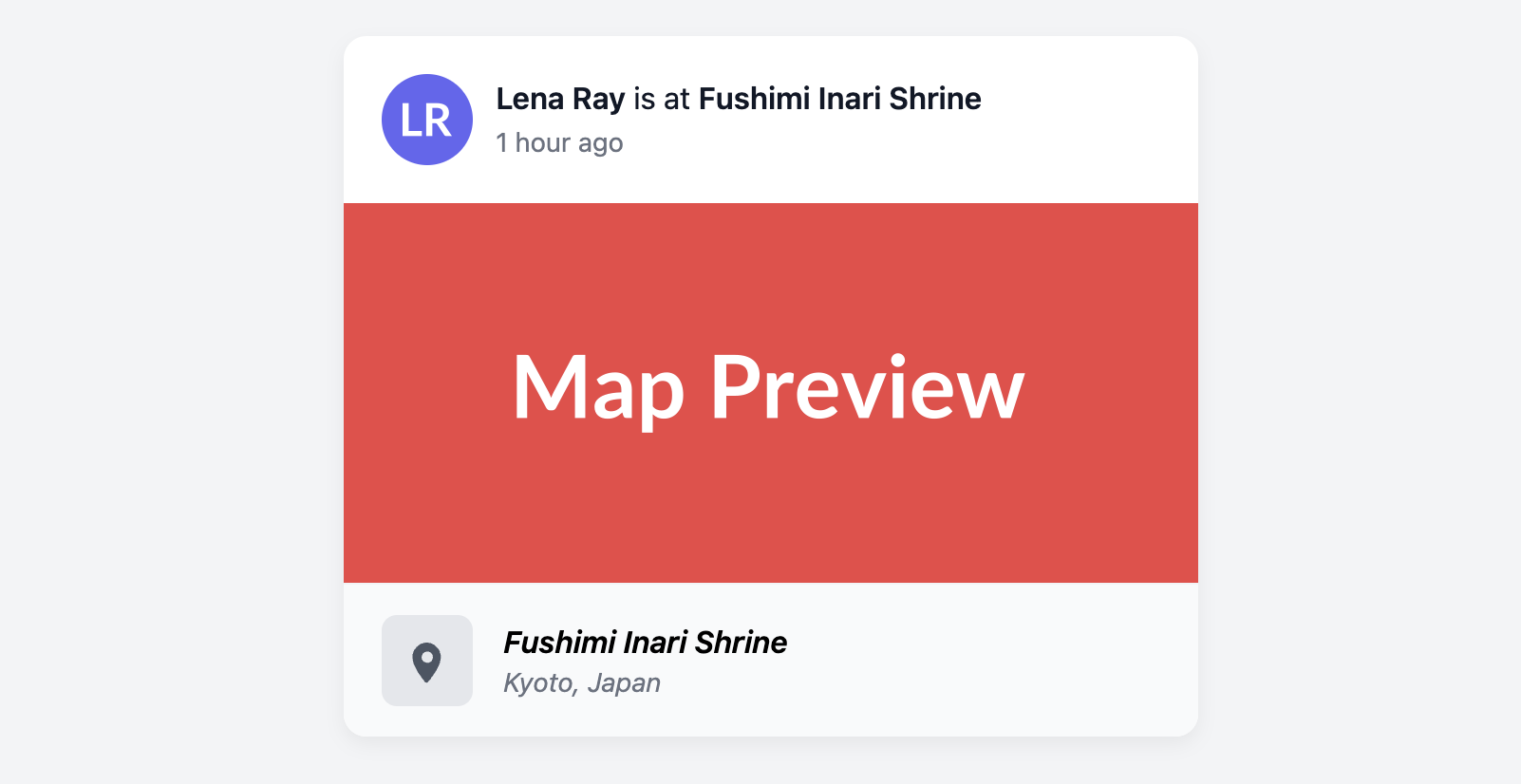
The structure of the card clearly separates the "who" from the "where." A header section displays the user's avatar and a summary of their action. A central area can optionally contain a large visual like a static map. A distinct footer block then reiterates the location's details with an icon and formatted text.
Features
- Clear Structure: The card is divided into distinct zones for the user, an optional visual (map/photo), and the location details, making the information easy to parse.
- Semantic Elements: The user action is in the
headerand the location details are wrapped in a semanticaddresstag. - Flexible Visuals: The space between the header and the location block is optional, allowing you to include a map preview or a photo, or to omit it for a more compact card.
Code Breakdown
HTML Structure
The card is built as an article. A header at the top contains the user's avatar and a div for their name and action summary. The middle of the card can optionally contain an anchor tag with an img to show a map preview. The final block, .checkin-card-location-block, holds the location icon and an address element with the location name and city.
CSS Styling
The layout uses Flexbox to align the elements within the header and the location block. A different background color (#f9fafb) is applied to the location block to create a clear visual distinction between the user's action and the place of that action. The rest of the styling focuses on establishing a clean typographic hierarchy and consistent spacing.
Code
Here is the complete, self-contained code. You can easily adapt it by populating it with user and location data. If you don't need a map preview, you can simply delete the anchor tag and image from the middle of the card.