Case Study Card
Present an in-depth summary of your projects with this professional case study card, designed to highlight key outcomes.
This component is a step up from a simple portfolio item. It uses a horizontal layout to provide space for a project summary and, crucially, a dedicated section to showcase quantifiable results and key performance indicators (KPIs).
About this Component
This card effectively communicates the value of your work by leading with a summary and finishing with hard data. The "Key Results" section at the bottom uses strong typography and color to make the positive outcomes of the project stand out, providing powerful social proof.
Features
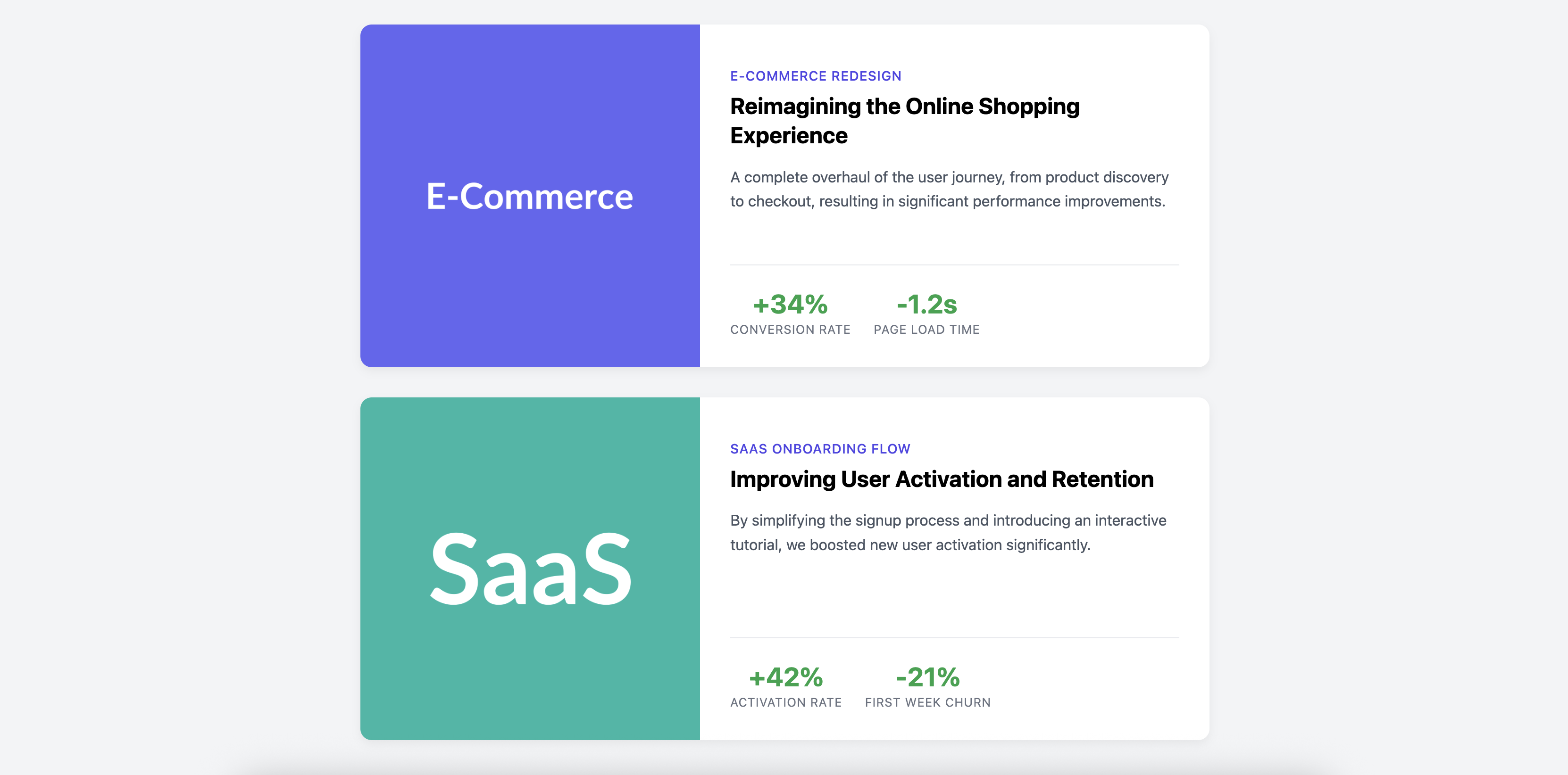
- Data-Driven Results: Includes a dedicated, border-separated section for highlighting key metrics and outcomes of the project.
- Responsive Layout: The two-column horizontal layout is ideal for desktop and cleanly stacks to a vertical layout on mobile devices.
- Full-Card Link: The entire card is a single, clickable link, providing a large, user-friendly target to direct visitors to the full case study.
Code Breakdown
HTML Structure
Each case study is an article. Its contents are wrapped in a single a tag, which is styled as a flex container. The link has two main children: a div for the image column (.cs-image-col) and a div for the content column (.cs-content-col).
Inside the content column, the "Key Results" are grouped in their own div, with each individual metric (e.g., "+34%") contained in its own div as well.
CSS Styling
The two-column layout is created by setting display: flex on the main card link. The content column (.cs-content-col) is also a flex container, with flex-direction: column. flex-grow: 1 on the main excerpt p tag is what pushes the "Key Results" section to the bottom, ensuring vertical alignment across multiple cards in a list.
A media query checks the screen width and changes the flex-direction of the card to column on smaller screens, which is what creates the stacked mobile layout.
Code
Here is the complete, self-contained code. It's ready to be populated with your own project images, summaries, and results to build an impressive case study page.