Wishlist/Favorite Product Card
Enable customers to save items for later with this clean and functional wishlist and favorites card.
This component provides a compact, list-friendly layout that includes essential information like a product's stock status, and features clear actions to either move the item to the cart or remove it from the list.
About this Component
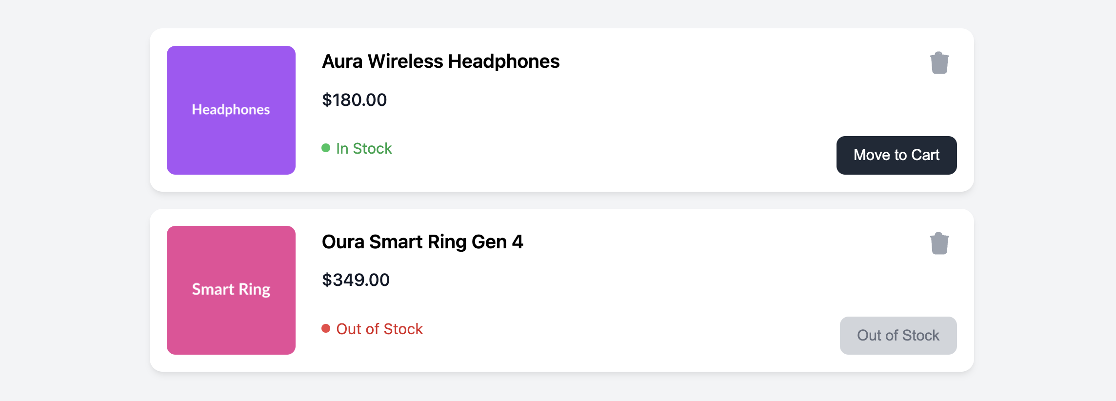
A wishlist is a useful feature for retaining customer interest. This template presents saved items clearly, showing the title and price, as well as the current stock status. This helps users make decisions about what to buy now versus what to wait for. The card is designed to be highly scannable and easy to interact with.
Features
- Stock Status Indicator: A clear, color-coded label shows whether an item is "In Stock" or "Out of Stock".
- Action-Oriented Design: The right side of the card is dedicated to user actions (moving an item to the cart and removing it from the wishlist).
- Disabled State: The "Move to Cart" button is disabled for out-of-stock items, preventing users from attempting to buy unavailable products.
- Responsive Layout: Uses a horizontal flex layout on larger screens and stacks vertically on mobile for optimal viewing everywhere.
Code Breakdown
HTML Structure
Each card is an article. The product information is split into three main columns created with Flexbox: an image, a details block, and an actions block. The stock status (.wishlist-card-stock-status) has a modifier class (.in-stock or .out-of-stock) which is used by the CSS to apply the correct colors. For unavailable items, the "Move to Cart" button has the disabled attribute.
CSS Styling
The main card (.wishlist-card) uses display: flex to create the side-by-side layout. Inside the details section, flex-grow: 1 ensures it takes up the available space. The stock status styling is handled by targeting the modifier classes. For example, .wishlist-card-stock-status.in-stock .dot sets the background color of the status dot to green. The action button's disabled state is styled using the :disabled pseudo-class, which applies muted colors and prevents interaction.
Code
Here is the complete, self-contained code. To mark an item as out of stock, apply the .out-of-stock class to the status element and add the disabled attribute to the button.