Horizontal Blog Card with Thumbnail
Display your articles in a compact, space-saving format with this horizontal blog card.
This layout is an excellent choice for any area where a full vertical card is too large, such as in a sidebar list of recent posts, a "related articles" section at the end of a post, or for a dense, list-style blog index.
About this Component
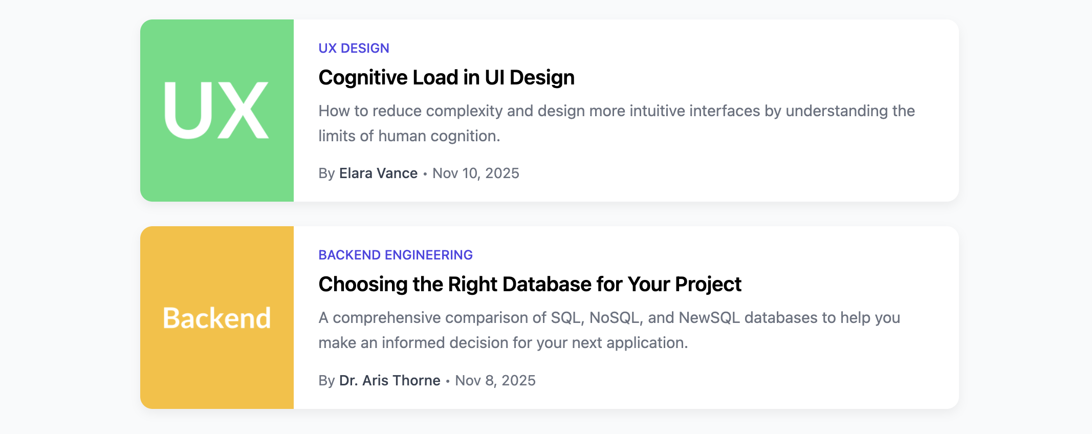
This component arranges a thumbnail image and the article's text content side-by-side. To maintain a clean and uniform look, it features an optional CSS line-clamping technique that truncates longer titles and excerpts. The card is fully responsive, stacking vertically on mobile devices to ensure readability.
Features
- Compact Horizontal Layout: The two-column design is ideal for presenting more articles in a smaller vertical space.
- Responsive Stacking: A media query transforms the layout to a single vertical column on narrow screens.
- Line-Clamp for Text: An optional (but included) CSS feature limits the title and excerpt to a set number of lines, preventing cards with longer text from disrupting the layout.
- Aligned Footer: Flexbox is used to ensure the author byline is always perfectly aligned at the bottom of the card.
Code Breakdown
HTML Structure
The entire card is an article. Inside, a single a tag makes the whole component clickable. The direct children of this link are the thumbnail img and a content div that holds the category, title, excerpt, and author footer.
CSS Styling
The main clickable link is a flex container (display: flex), which arranges the image and content block horizontally. The content block is also a flex container, but with flex-direction: column. This allows the footer to be pushed to the bottom of the card by setting margin-top: auto. This is a clean and simple way to achieve consistent vertical alignment of the bylines. The optional line-clamping is a modern CSS technique that uses display: -webkit-box, -webkit-box-orient: vertical, and -webkit-line-clamp to truncate text effectively.
Code
Here's the complete, self-contained code. It's ready to be used to build a compact and scannable list of your latest articles.