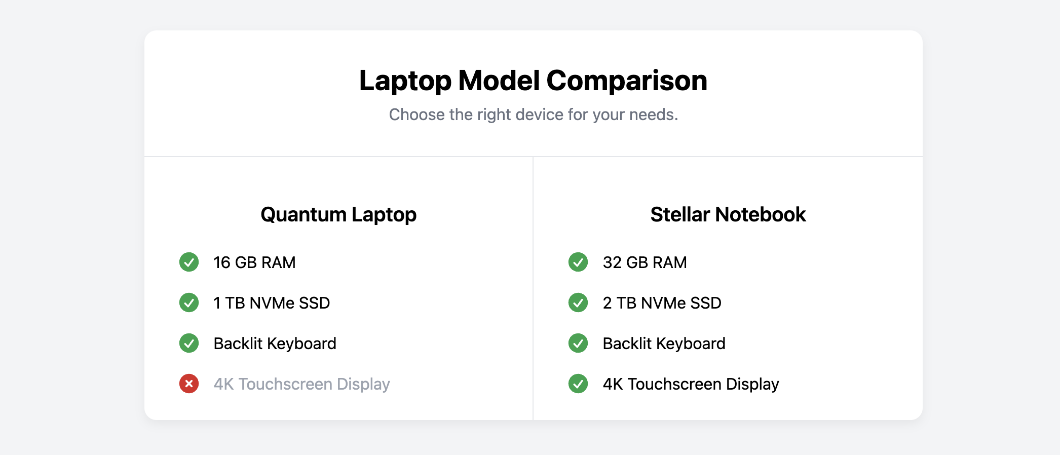
Comparison Card (Product A vs. B)
Help users make informed decisions by presenting a direct, side-by-side comparison of two items with this responsive card.
This component is a great alternative to a full pricing table when you need to provide a comparison of two specific products or plans. It clearly lists features with "included" or "excluded" indicators.
About this Component
This comparison card is built with a two-column layout that is perfect for desktop viewing. On smaller screens, the columns automatically stack vertically to ensure the content remains readable and well-formatted. It uses color-coded icons to provide instant visual feedback on which features are included with each option.
Features
- Responsive Two-Column Layout: Uses CSS Grid to create a side-by-side comparison that cleanly stacks into a single column on mobile devices.
- Clear Feature Indicators: Employs color-coded checkmark and cross icons to visually confirm whether a feature is included or excluded.
- Modular & Self-Contained: The entire comparison table is a single card component that can be easily placed anywhere on your page.
Code Breakdown
HTML Structure
The entire component is an article. A header provides an overall title for the comparison. The core of the layout is a div with the class .comparison-grid, which contains two child divs, one for each column. Inside each column, a features list is created using a standard ul. Each list item (li) includes an SVG icon and the feature text. To indicate a feature's status, a modifier class (.is-included or .is-excluded) is added to the li.
CSS Styling
The .comparison-grid is styled with display: grid and grid-template-columns: 1fr 1fr, which creates the two equal-width columns. A simple border on the right of the first column creates the vertical dividing line. The icons are colored by targeting the modifier classes. For example, .is-included svg sets the icon color to green. A media query checks the screen width and changes the grid-template-columns to 1fr on smaller screens, causing the two columns to stack vertically.
Code
Here is the complete code. You can easily customize it by changing the product names and updating the feature lists for your specific comparison.