Podcast Episode Card
Feature your latest podcast episodes in a clean, professional, and list-friendly format with this specialized card.
This component is designed to give listeners all the key information they need at a glance. This includes the episode number and duration, a compelling title, and a brief summary, all accompanied by an unmissable play button.
About this Component
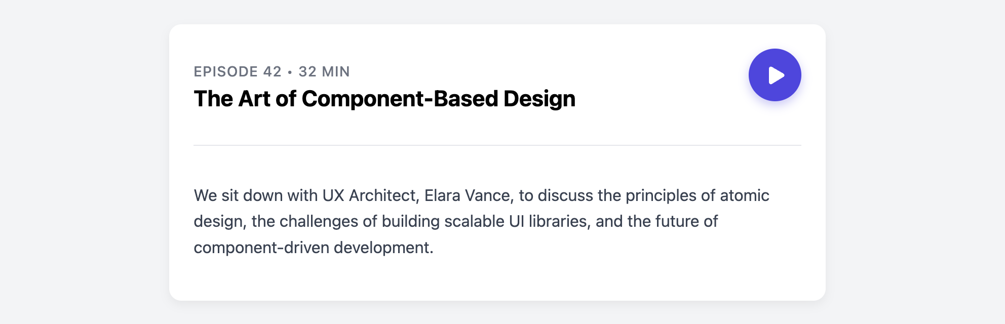
This card presents its content in a clear, top-to-bottom hierarchy. The header area groups the main clickable elements (the episode title and the play button) while a distinct, border-separated section below provides the episode summary. The layout is managed with Flexbox, ensuring all elements are neatly aligned.
Features
- Action-Oriented Header: The title (which links to the episode page) and the main "play" button are placed together for prominence.
- Clear Information Hierarchy: A metadata line provides important details like episode number and duration, while the larger title draws the most attention.
- Standalone or List Format: The card is self-contained and works equally well on its own or stacked in a vertical list of episodes.
- Accessible: The title is a semantic heading, and the play button has a clear
aria-label.
Code Breakdown
HTML Structure
Each episode card is an article. A header element contains the main details and the play button. The episode summary is placed in a separate div below the header. The title is a clickable link for users who may want to navigate to a dedicated page for the episode to see show notes or transcripts.
CSS Styling
The card header (.episode-card-header) is styled with display: flex and justify-content: space-between. This creates the two-column layout, pushing the title block to the left and the play button to the far right. The play button itself uses Flexbox to perfectly center the SVG icon inside it. A subtle box-shadow and transform on the button's hover state adds a pleasing micro-interaction.
Code
Here's the complete code. It's ready to be used for a podcast website or any audio-based content list.