User Bio Card with Social Links
A stylish and comprehensive card for showcasing a user profile with a background header, avatar, and short biography.
This layout is ideal for author boxes at the end of blog posts, speaker profiles for an event, or any place you need to provide more personal detail than a simple team member card.
About this Component
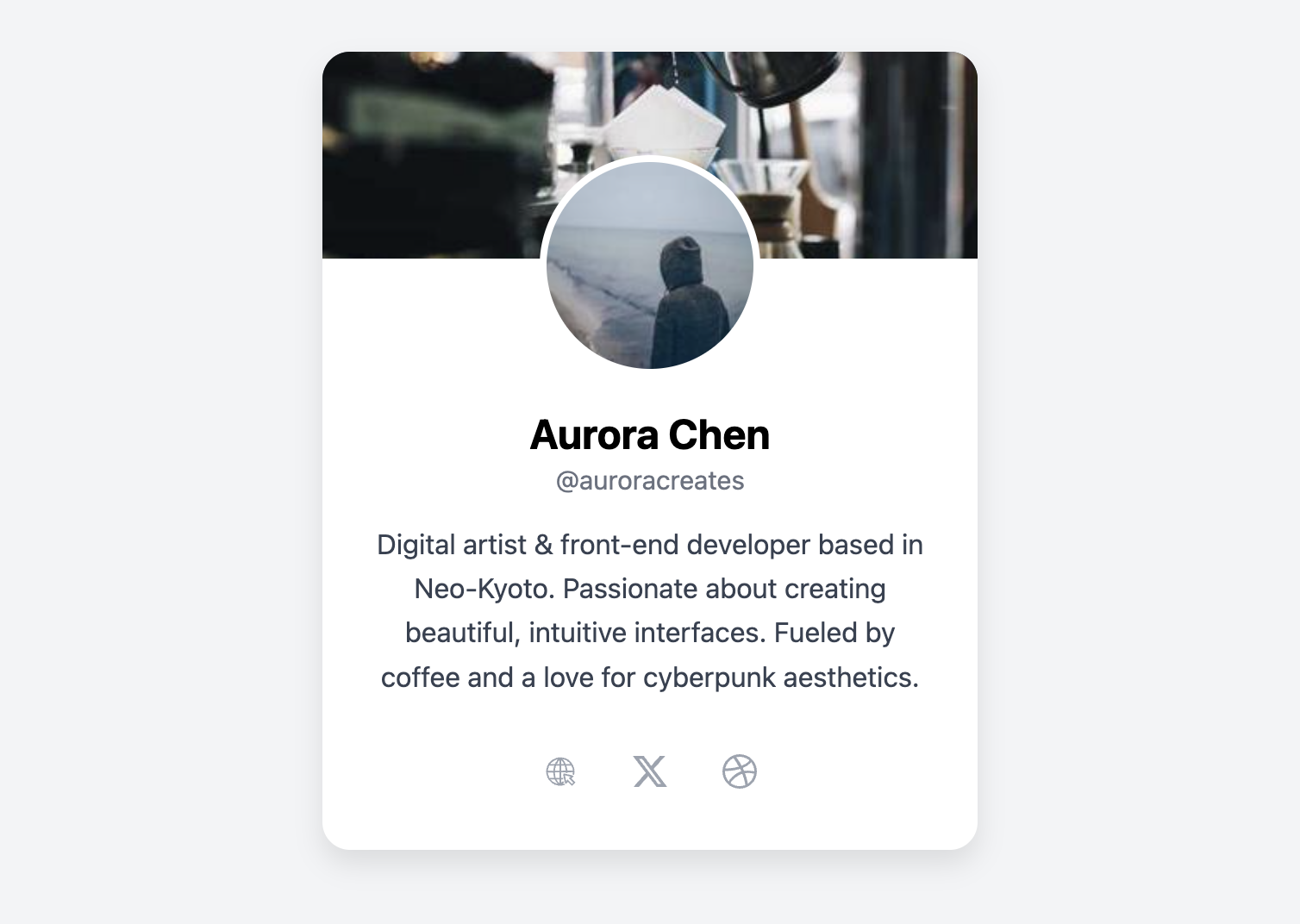
This profile card uses a layered header effect to create a modern and visually appealing design. A background image provides personality, while the main user avatar overlaps the header to create a sense of depth. Below, there is ample space for a name, a username or handle, a descriptive bio, and a row of social media icons.
Features
- Layered Header Design: The user avatar is pulled up to overlap the header image using a negative margin, a simple but effective technique for creating visual depth.
- Dedicated Bio Section: Includes a multi-line paragraph perfect for a short biography or description.
- Customizable Header: The header can feature a background image to add a unique visual identity to each user's card.
- SVG Icons: Includes clean, inline SVG icons for social media links, requiring no external font libraries.
Code Breakdown
HTML Structure
The card is built inside an article tag with the class .ub-card. The structure is split into two parts: a header element containing the background image, and a main div containing all the profile details. The order of elements is straightforward and semantic, progressing from the avatar to the name, handle, bio, and social links.
CSS Styling
The layout is achieved with the .ub-card-profile container. It's styled with a negative top margin (margin-top: -60px;) which pulls the entire content block upwards, causing the avatar to overlap the header area. It's also given position: relative to ensure its contents appear correctly stacked on top. The circular avatar has a white border which helps it stand out clearly from the header image behind it. The rest of the card is styled with basic typography and a display: flex container for the social icons.
Code
Here is the complete code. You can easily customize the card by changing the header and avatar images, editing the text content, and updating the social media links.