Followers/Following Summary Card
Provide a quick, at-a-glance summary of a user's profile with this compact social metrics card.
This component is perfect for profile pages, sidebars, or any "who to follow" suggestion list. It clearly presents key statistics in a clean and organized layout.
About this Component
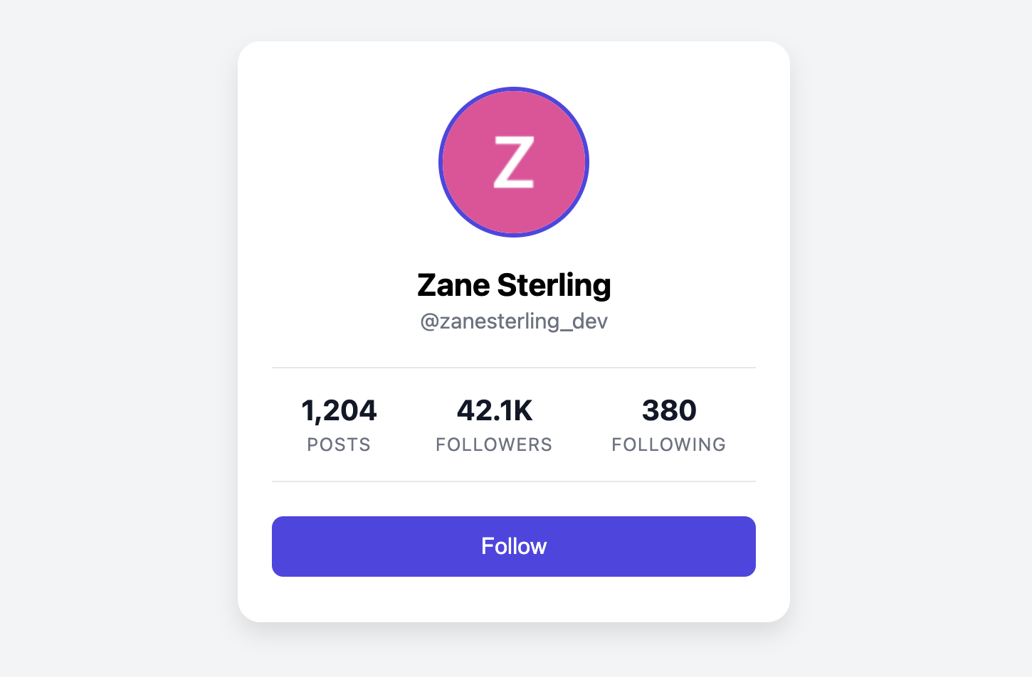
This card is designed to be data-forward. After the primary user identification (avatar and name), the most prominent feature is a horizontal row displaying social statistics like post count, followers, and following. A large call-to-action button at the bottom encourages user engagement.
Features
- Clear Stats Display: Social metrics are arranged in a clean, easy-to-read row using Flexbox.
- Prominent Call-to-Action: Includes a full-width, styled "Follow" button to drive interaction.
- Centered Layout: All elements are centered for a balanced and professional appearance.
- Self-Contained: The component is a single, self-contained unit that is easy to place anywhere in your layout.
Code Breakdown
HTML Structure
The card is built within an article tag. The main profile info (avatar, name, handle) comes first. The statistics are grouped in a div with the class .ffs-stats-container. Inside, each individual statistic (e.g., "Posts") is its own div containing a strong element for the number and a span for the label. The structure is completed with a button at the end.
CSS Styling
The entire card is centered with text-align: center. The main layout feature is the .ffs-stats-container, which uses display: flex and justify-content: space-around. This distributes the stat items evenly across the available horizontal space, with equal space around each item, creating a balanced row. Typographic hierarchy is established using different font sizes and weights for the numbers and their labels.
Code
Here is the complete code. You can easily adapt it by customizing the profile information, stats, and button text.