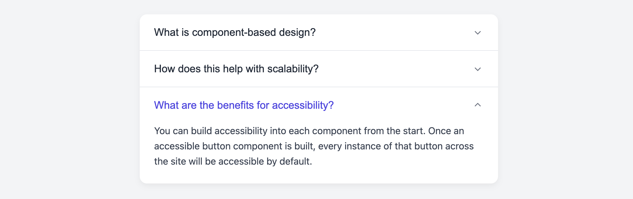
Accordion Card
Organize and display detailed information in a compact space with this interactive accordion card.
This is a classic component for "Frequently Asked Questions" (FAQ) pages, product feature lists, or any content that can be broken down into collapsible sections. This implementation ensures only one item can be open at a time, keeping the interface clean and focused.
About this Component
This template combines a sleek visual design with the robust functionality of a true accordion. Clicking one item's header will automatically close any other item that is currently open. This behavior is managed by a small, dependency-free JavaScript snippet. The smooth open/close animation is handled by a modern CSS Grid technique.
Features
- True Accordion Behavior: JavaScript ensures that only one panel can be open at any given time, preventing the card from becoming overly long.
- Smooth Animation: Uses a CSS Grid animation on the
grid-template-rowsproperty to create a smooth, jank-free collapse and expand effect. - Accessible: Each toggle is a proper
buttonwith thearia-expandedattribute, which correctly informs screen readers about the state of the collapsible content.
Code Breakdown
HTML Structure
The entire component is wrapped in a main div class="accordion-card". Inside, each collapsible section is its own div class="accordion-item". Each item contains a button that serves as the header and a div for the collapsible content. This structure is repeated for every item in the accordion.
CSS Styling
The open/close animation is identical to the one used in the Expand/Collapse card. The content container (.accordion-item-content) is a grid container with its grid-template-rows property animated from 0fr (collapsed) to 1fr (fully expanded). This transition is triggered when the parent .accordion-item gets an .is-open class. The animated rotation of the chevron icon is also handled by a transform property tied to this same class.
JavaScript Logic
The script adds a click listener to each accordion header. When a header is clicked:
- It first searches for any other item within the card that currently has the
.is-openclass and removes it, effectively closing it. - It then toggles the
.is-openclass on the specific item that was just clicked. - Finally, it updates the
aria-expandedattribute on the clicked button to reflect its new state.
This "close others first, then toggle self" logic is what creates the true accordion effect.
Code
Here is the complete, self-contained code. You can easily build an FAQ or similar component by adding more .accordion-item blocks inside the main container.