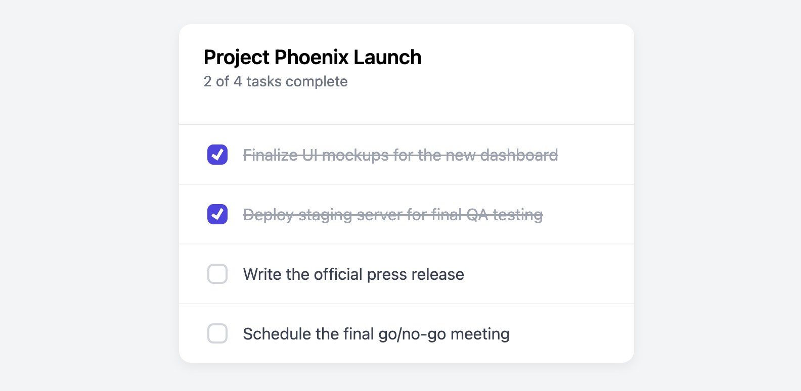
Tasks or To-do Card
Organize and track tasks in a simple and intuitive list format with this to-do card.
This is a perfect component for personal dashboards, project management applications, or any interface where users need to manage a list of actionable items. The strikethrough effect for completed tasks is handled entirely by CSS.
About this Component
This template uses a CSS-only approach to provide the core interactivity of a to-do list. When a user clicks a checkbox, the associated text is immediately struck through with a line, providing clear visual feedback that the task is complete. The component is fully accessible, using semantic HTML for all interactive elements.
Features
- CSS-Only Strikethrough: The visual "completed" state (a checkmark, a line through the text, and muted color) is triggered instantly by a checkbox without requiring any JavaScript.
- Custom-Styled Checkbox: The browser's default checkbox is replaced with a clean, modern, and fully stylable version created with CSS.
- Accessible: Each checkbox and its corresponding text are correctly linked using a
andfor/idattributes, making the component fully navigable by keyboard and understandable to screen readers. - Clear Structure: A distinct header provides context for the task list, and each item is clearly separated by a border.
Code Breakdown
HTML Structure
The card is built as a section. A header contains the title of the list. The tasks themselves are an unordered list (ul), with each task being a list item (li). Inside each list item, the input type="checkbox" and its corresponding label are placed right next to each other as siblings.
CSS Styling
The custom checkbox style is created by hiding the default checkbox (appearance: none) and then styling a ::before pseudo-element with a clip-path property to create the visible checkmark shape.
The interactive strikethrough effect is achieved with the CSS adjacent sibling selector (+). The input checkbox itself is what holds the state (checked or unchecked). The applicable CSS rule is .todo-item input[type="checkbox"]:checked + label. This rule reads as: "When an input of type checkbox is checked, select the label element that is immediately its next sibling." The styles inside this rule (text-decoration: line-through and a muted color) are only applied when the checkbox is checked.
Code
Here is the complete code. You can easily build your task list by adding or removing the list items (li). To mark a task as complete by default, just add the checked attribute to its input element.