Project Overview Card
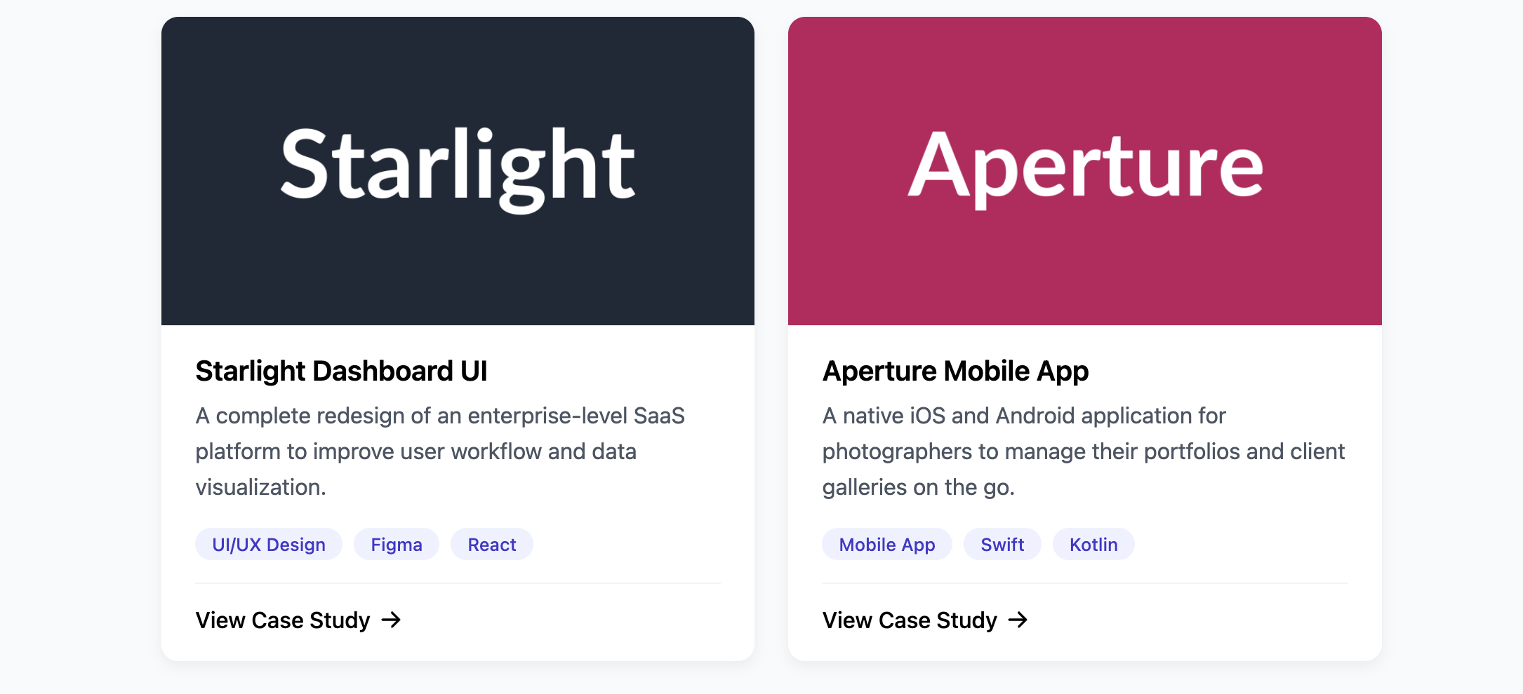
Showcase your work in a clean, professional, and scannable format with this portfolio project card.
This is a core component for any portfolio website. It provides a visual and textual summary of a project, highlighting the main technologies or skills involved, and linking users to a more detailed case study.
About this Component
The design of this card balances a strong visual (the project image) with clear, hierarchical information. A short description gives context, while the "pill" style tags allow a user to quickly see the technologies used. The entire layout is structured to lead the user to the "View Case Study" call-to-action.
Features
- Technology/Skill Tags: A dedicated section displays a flexible list of tags, perfect for showing the tech stack (e.g., React, Figma) or skills (e.g., UI/UX Design) used in the project.
- Flexible Height: The card uses Flexbox to ensure the footer section is always aligned at the bottom, creating a uniform look across a grid of multiple projects.
- Engaging Hover Effects: A subtle "lift" effect on the card and a "zoom" on the image provide pleasant interactive feedback.
Code Breakdown
HTML Structure
The card is a semantic article. A clickable a tag wraps the image, while another wraps the h3 title. The main content area contains a description paragraph, a div for the list of tags, and a footer with the main call-to-action link.
CSS Styling
The card's main content area (.po-card-content) is a flex container with flex-direction: column. The key property is flex-grow: 1 on the project description (.po-card-description). This makes the description paragraph expand to fill all available vertical space, pushing the tags and the footer neatly to the bottom of the card. This technique ensures that cards with varying amounts of text will still have their footers aligned when placed in a grid.
Code
Here's the complete, self-contained code. It's ready to be used to build a beautiful and effective portfolio gallery.