Card with Expand & Collapse Toggle
Elegantly show and hide additional content within a card using this interactive, animated expand and collapse component.
This is a highly versatile pattern for FAQs, showing detailed product information, or any situation where you want to keep the initial UI clean and allow users to reveal more content on demand.
About this Component
This component combines HTML, CSS, and JavaScript to create a functional and visually pleasing user experience. The JavaScript is designed to handle any number of these cards on a single page, each operating independently. Modern CSS techniques create a smooth animation without flickering or content jumps.
Features
- Handles Multiple Instances: The script automatically finds and manages all toggle cards on a page, allowing them to work independently without conflicts.
- Smooth Animation: Uses a CSS Grid technique to animate the height of the collapsible section, providing a more reliable and smoother transition than older methods.
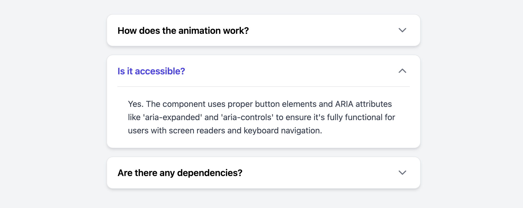
- Accessible: Implements ARIA attributes like
aria-expandedandaria-controlsto ensure the component is usable by people relying on assistive technologies. The trigger is a properbuttonfor keyboard accessibility. - Animated Icon: The chevron icon smoothly rotates to indicate the open or closed state of the collapsible panel.
Code Breakdown
HTML Structure
Each card requires a unique id on its main container, title, and collapsible content area. This is essential for the aria-controls and aria-labelledby attributes to work correctly, which creates a semantic link between the button and the content it controls for assistive technologies.
CSS Styling
The height animation uses CSS Grid. The collapsible container (.ecec-card-collapsible) is set to display: grid and has its grid-template-rows property animated from 0fr (zero fraction, or collapsed) to 1fr (one fraction, or expanded). The icon's rotation is handled by a simple CSS transform, which is toggled by the presence of an .is-open class on the main card.
JavaScript Logic
The script uses querySelectorAll()to find all card headers on the page and attach a click listener to each. When a header or its button is clicked, it uses .closest('.ecec-card') to find the specific parent card for that trigger. It then toggles an .is-open class on that specific card and updates its button's aria-expanded attribute. This instance-specific approach is what allows multiple cards to function independently.
Code
Here's the complete, self-contained code. Simply place the CSS, HTML, and JavaScript in your project as instructed. You can add or remove cards from the list as needed, ensuring each has a unique set of IDs.