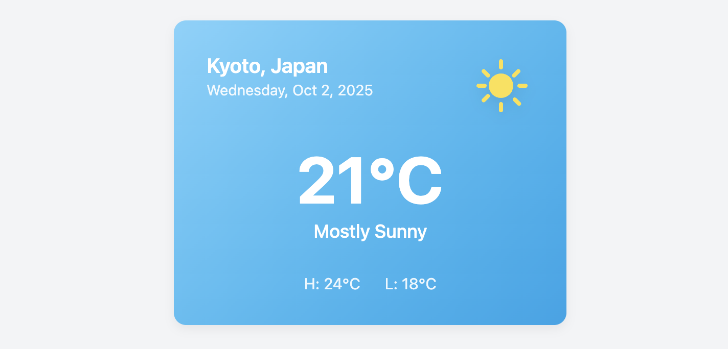
Weather Card
Display current weather conditions in a vibrant, easy-to-read format with this compact weather card.
This is a perfect component for a user dashboard, a travel website's destination page, or as a widget on a portal homepage. The card is themed with a gradient background and a prominent icon for a modern look.
About this Component
This template uses CSS variables and a background gradient to create a visually appealing theme. All the essential information is arranged in a clear hierarchy that's easy to understand at a glance.
Features
- Themed Design: The card uses a CSS gradient and themed text/icon colors to create a cohesive look. Colors can be easily customized via CSS variables.
- Data-Rich Display: The layout is designed to present a lot of information in a very small and well-organized space.
- SVG Iconography: A large, clean SVG icon provides a quick visual reference for the current weather conditions.
- Clear Typography: A strong typographic scale makes the current temperature the most prominent element, guiding the user's eye.
Code Breakdown
HTML Structure
The card is built as a single article. Its content is divided into a header for the location and date, a main div for the primary temperature and condition, and a footer for the high/low temperatures. A div also wraps the SVG weather icon.
CSS Styling
The card's theme is controlled by three main CSS variables: --weather-bg-gradient, --weather-text-color, and --weather-accent-color. By changing these, you could easily create new themes (e.g., a gray, cloudy theme or a dark, stormy theme). The header and footer use display: flex and justify-content: space-between to correctly position their child elements. A subtle filter: drop-shadow() on the weather icon gives it a slight sense of depth, lifting it off the gradient background.
Code
Here is the complete code. You can easily adapt it to other weather conditions by changing the icon and updating the theme colors in the CSS variables.