Tweet-style Card
Display social media posts, status updates, or short messages in the familiar style of a modern microblogging platform.
This component mimics the UI of a "tweet," making it instantly recognizable to users. It's a complete card featuring an author byline, post content, an optional image preview, timestamp, and a full set of action buttons.
About this Component
This is a CSS-only template that structures content to look like a post on X (formerly Twitter). It uses Flexbox extensively for alignment, ensuring that the author info, main content, and the row of action buttons are all laid out correctly and responsively. Color-coded hover states on the action buttons provide clear interactive feedback.
Features
- Familiar UI: The design closely resembles a tweet/X post, making it intuitive for users.
- Full Action Bar: Includes icon-and-text buttons for Reply, Retweet/Repost, Like, and View counts, with themed hover colors.
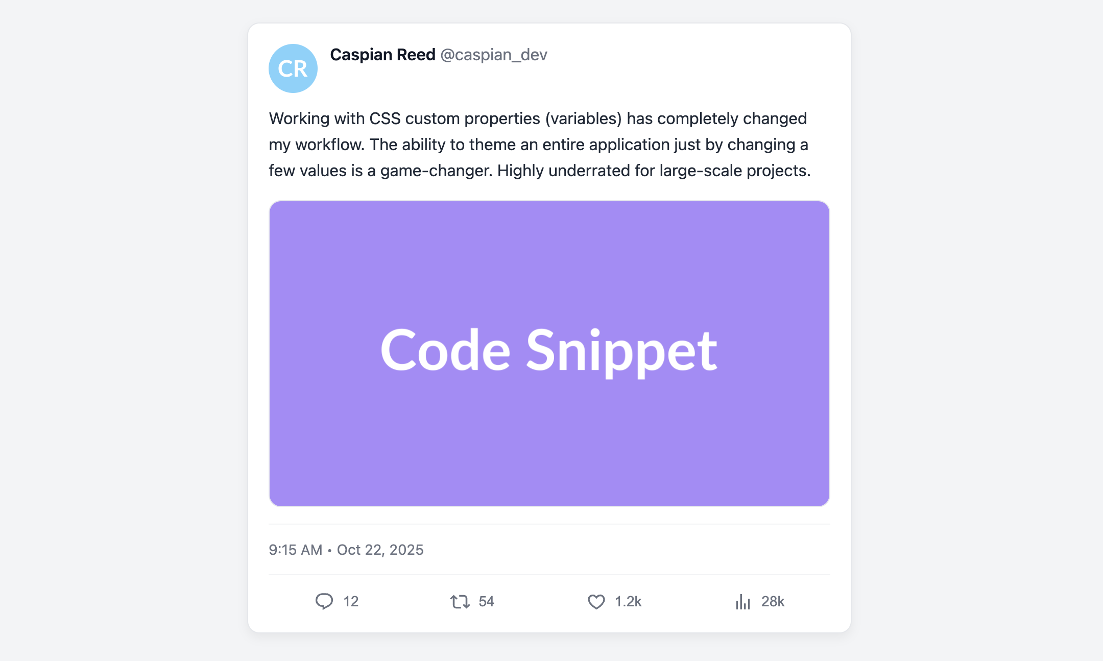
- Optional Media Preview: The card is designed to gracefully accommodate an optional image preview.
- Semantic Structure: Uses semantic
article,header, andfootertags for a well-organized and accessible structure.
Code Breakdown
HTML Structure
The entire component is wrapped in an article tag. The header contains the user's avatar img and a div with their name and handle. The main post content is a simple p tag, followed by an optional linked img for media. A div displays the clickable time element. The footer houses the action buttons.
CSS Styling
The header and footer are both styled with display: flex. In the header, this places the avatar and user info side-by-side. In the footer (.tweet-actions), justify-content: space-around distributes the action buttons evenly across the width of the card. The colored hover effects on the action buttons are achieved by adding modifier classes (e.g., action-like) and defining a :hover pseudo-class for each one to change its color.
Code
Here is the complete, self-contained code. You can easily adapt it for an activity feed, social media clone, or any place you need to display short, user-generated posts.