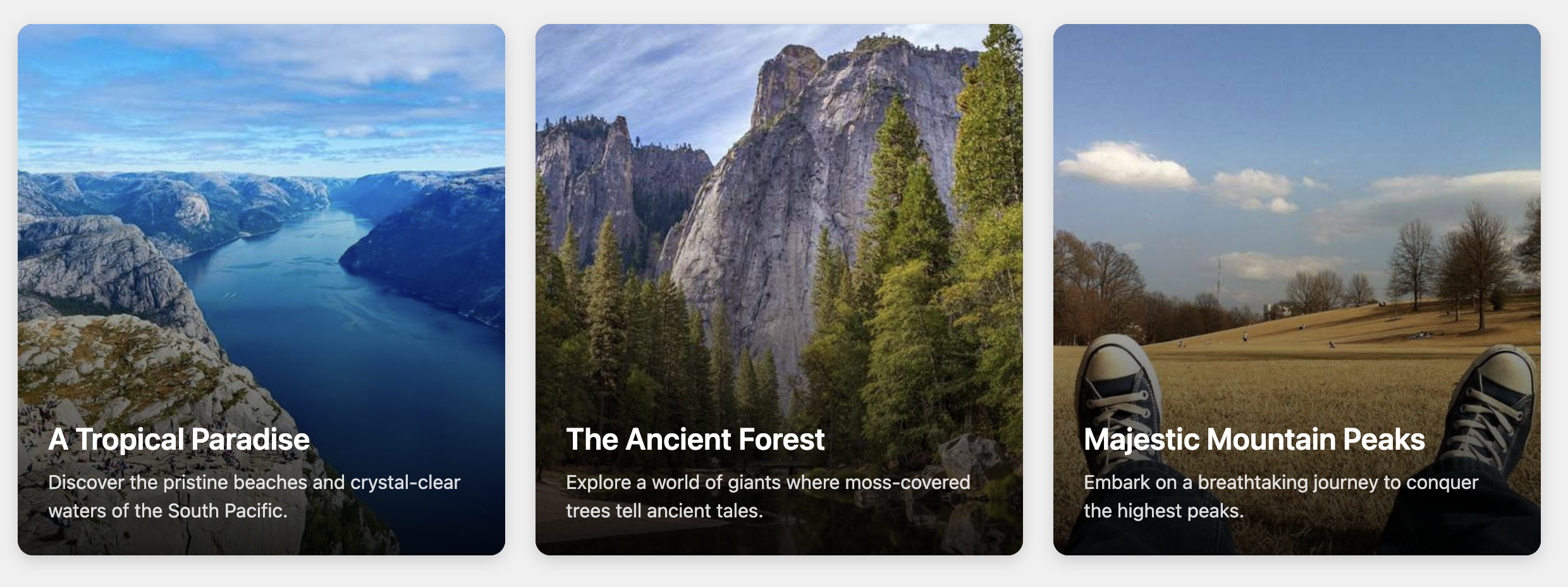
Overlay Text on Image Card
Create visually compelling links with this template that places text directly on top of a full-card background image.
This "hero" style card is perfect for grabbing user attention and works well for featured articles, travel destinations, or portfolio highlights where a strong visual is important.

About this Component
The main feature of this card is its layered structure, achieved through CSS positioning. An image serves as the bottom layer, a semi-transparent gradient is layered on top to ensure the text is readable, and the text content itself forms the top layer. The result is a dynamic, modern card that prioritizes imagery.
Features
- Gradient Overlay: A built-in linear gradient, created with a CSS pseudo-element, darkens the bottom of the card to guarantee high-contrast, readable text over any image.
- Hover Zoom Effect: A subtle zoom animation on the background image adds a touch of interactive polish.
- Layered with CSS: Makes use of the CSS
positionandz-indexproperties to control the stacking of elements. - Responsive & Flexible: The component is fully responsive and is placed inside the standard grid container for easy integration into multi-card layouts.
Code Breakdown
HTML Structure
The entire card is an anchor (a) tag with the class .oti-card. This makes the whole unit a single clickable link. Inside, the structure is simple: an img element for the background and a div that wraps the text content (h3 and p).
CSS Styling
The layering effect is controlled by a CSS stacking context.
- The main card (
.oti-card) is set toposition: relative, which establishes the positioning boundary for its children. - The image (
.oti-card-image) is set toposition: absolutewith az-indexof1. This places it in the background layer and makes it fill the card's dimensions. - A CSS pseudo-element (
.oti-card::before) is used to create the gradient overlay. It is also absolutely positioned, but with az-indexof2, placing it directly on top of the image. Thebackgrounduses thelinear-gradient()function to transition from dark and opaque at the bottom to transparent at the top. - The text container (
.oti-card-content) has aposition: relativeand az-indexof3, which ensures it sits on the very top layer, above the gradient and image. - Finally, Flexbox properties on the main card are used to push this content block to the bottom of the card.
Code
Here's the complete code for the card. The template is ready to use and can be customized by changing the images or modifying the CSS variables.