Statistical Data Card
Display key performance indicators (KPIs) in a clean, concise, and scannable format with this statistical data card.
This is a fundamental component for any dashboard or analytics page. It's designed to provide a high-level overview of important metrics at a glance, with color-coded trend indicators to show performance over time.
About this Component
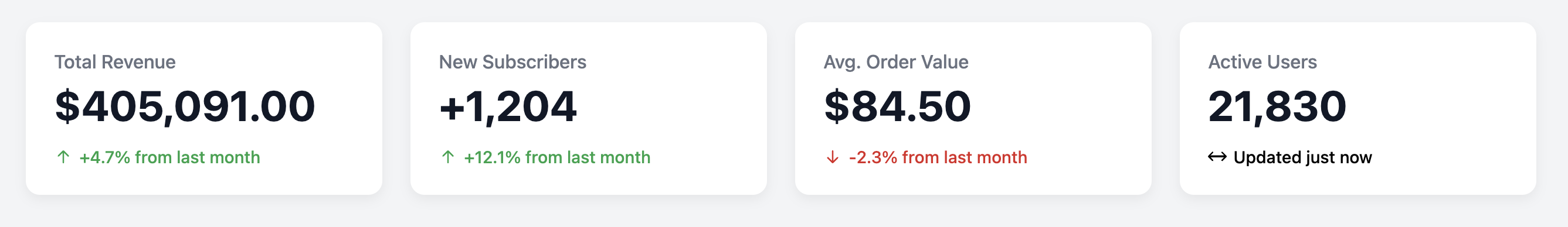
The card design prioritizes the main data point by making it the largest and boldest element. Below it, a smaller comparison metric shows the change from a previous period (e.g., last month), and is accompanied by an icon and color to indicate a positive (green up arrow) or negative (red down arrow) trend.
Features
- Clear Data Hierarchy: The large font size for the main statistic immediately draws the user's eye to the most important piece of information.
- Color-Coded Trend Indicators: Simple modifier classes (
.is-positive,.is-negative) make it easy to apply the appropriate color and icon to the comparison metric. - SVG Icons: Includes clean, lightweight SVG icons for trend arrows that can be easily styled with CSS.
- Dashboard-Ready: Designed to fit perfectly within a grid, allowing you to build a full dashboard of important metrics.
Code Breakdown
HTML Structure
Each card is a simple div. The content follows a logical order of an h3 for the metric's title (e.g., "Total Revenue"), a p for the main number, and a final div for the comparison data. To indicate a trend, you add either the .is-positive or .is-negative class to this final div.
CSS Styling
The layout within the card is a standard vertical block flow. The main visual logic comes from the modifier classes. The CSS targets these classes to apply a color to the text and the SVG icon within. For example, the rule .stat-card-comparison.is-positive sets the color property to a green variable. Since the SVG's fill is set to currentColor, it automatically inherits this color from its parent.
Code
Here is the complete, self-contained code. To use it, simply choose the appropriate trend icon and apply the corresponding modifier class to show positive or negative growth.