Settings Section Card
Organize your application's settings into logical groups with this clean and well-structured section card.
This component is a "container" card, designed to wrap around a set of related settings or form controls. It's an excellent approach for creating a user-friendly and easy-to-navigate settings page.
About this Component
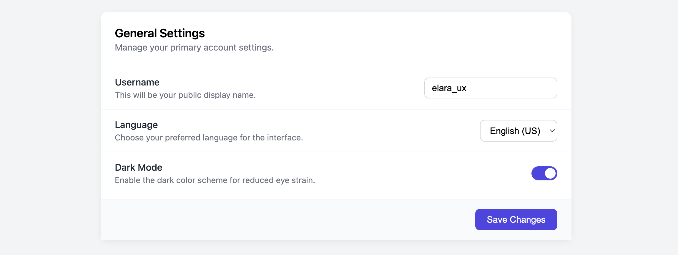
The card is divided into a header, a body, and a footer. These are three distinct zones. The header provides a title and description for the settings group (e.g., "General Settings"). The body is the flexible area where you can place individual setting items, like the text input, select dropdown, and toggle switch shown in the example. The footer is designed to hold the primary actions for the section, such as a "Save Changes" button.
Features
- Structured Layout: The header, body, and footer structure provides a clear and organized way to present a group of settings.
- Flexible Content Area: The card body can hold any number of setting items, such as text inputs, select menus, or custom components like the Settings Toggle Card.
- Clear Action Area: The distinct footer, often styled with a different background color, makes the primary "Save" action unmissable.
Code Breakdown
HTML Structure
The entire component is a semantic section. This is the appropriate element for a thematic grouping of content. The section is then divided into a header, a div for the main body content, and a footer for the save button. Each individual option within the body is a div with the class .setting-item. This container holds the option's label and description on one side, and the interactive form element (e.g., input, select) on the other.
CSS Styling
The component's styling primarily focuses on creating clear visual separation between the different parts. Simple borders are used to divide the header, body items, and footer. The .setting-item class is a Flexbox container with justify-content: space-between, which neatly pushes the setting's label to the left and its corresponding form control to the right.
Code
Here's the complete, self-contained code. You can easily build out a settings page by adding your own form controls into the .settings-section-body.