Product Quick View Card
Enhance your online store's browsing experience with this product card featuring a "Quick View" button that appears on hover.
This common e-commerce pattern allows customers to view product details in a popup or modal without leaving the main category page, leading to a faster and more fluid shopping experience.
About this Component
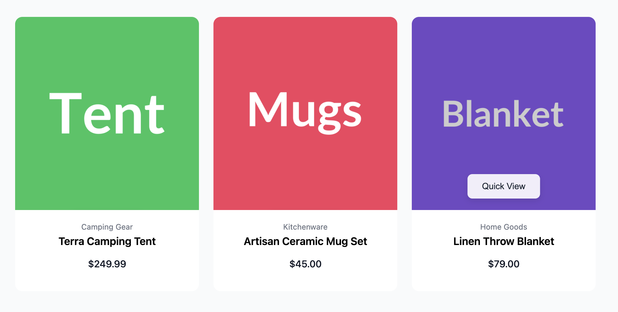
This purely CSS-based component creates an interactive effect where hovering over the product image reveals a "Quick View" button. It uses a combination of CSS positioning and transforms to slide the button into view smoothly. The card's content is displayed below the image in a clean, centered layout.
Features
- Hover-to-Reveal Button: The "Quick View" button is hidden by default and animates into view when a user hovers over the image.
- CSS-Only Interactivity: The entire hover effect is achieved with CSS, requiring no JavaScript for the card's animation.
- Subtle Overlay & Zoom: Hovering also applies a slight dimming effect and a subtle zoom to the image, enhancing the interactive feel.
- Accessible: The product information is wrapped in links with an appropriate
aria-labelto describe the action to assistive technology users.
Code Breakdown
HTML Structure
Each product card is an article. The main part is the .qv-card-image-container, which holds both the main product image link and the "Quick View" button. The product information (category, title, price) is contained in a separate block below.
CSS Styling
The "Quick View" button (.qv-quick-view-btn) is positioned absolutely within its container. Its initial state is set using transform: translate(-50%, 150%). This moves it horizontally to the center (the -50% on the X-axis) and vertically pushes it down and out of sight (the 150% on the Y-axis). A transition is set on the transform property.
When the user hovers over the parent container (.qv-card-image-container:hover), the style for the button changes to transform: translate(-50%, 0). This keeps it centered horizontally but moves it to its natural vertical position (Y-axis 0). Because of the transition, the browser smoothly animates the button between these two positions, creating the "slide-in" effect.
Code
Here is the complete code. This template provides the card component; you will need to add your own JavaScript to handle the action when the "Quick View" button is clicked (e.g., opening a modal).