Card with Hover Effects
Add a layer of interactive polish to your designs with this collection of simple, CSS-only card hover effects.
This template provides several common animation styles that you can easily apply to your cards to provide satisfying visual feedback to users.
About this Component
This component is a practical demonstration of how to use CSS transitions and the :hover pseudo-class to create a more dynamic user interface. The effects are modular, meaning you can pick the one you like and apply it without needing the code for the others.
Effects Included
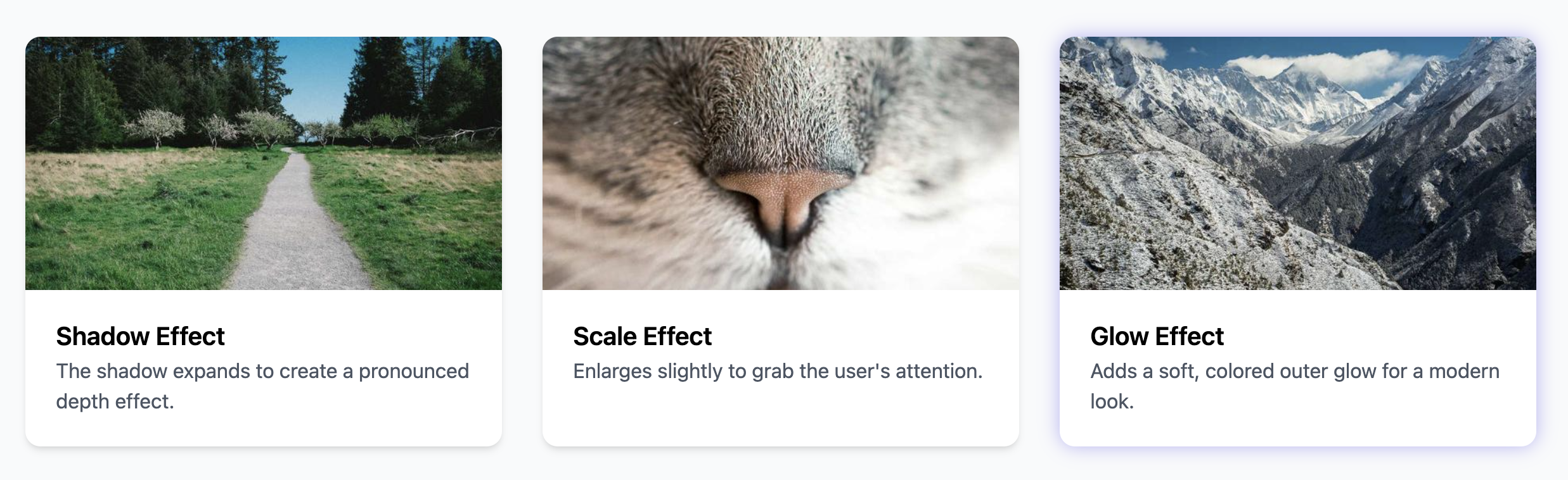
- Lift: The card moves up slightly, creating a sense of floating.
- Shadow Grow: The card's shadow expands, enhancing its perceived depth.
- Scale: The card gets slightly larger, drawing attention to itself.
- Glow: A soft, colored shadow appears around the card, useful for a modern, techy aesthetic.
- Border: A colored border animates in, which is great for selections or highlighting.
Code Breakdown
HTML Structure
The component uses a base card element with the class .he-card. To apply a specific hover effect, you simply add the corresponding modifier class to the same element. For example, to use the lift effect, your class attribute would look like class="he-card hover-lift".
CSS Styling
The hover effect happens with the CSS transition property, which is defined on the base .he-card style. This property tells the browser to smoothly animate any changes to the listed properties (transform, box-shadow, border-color) over a set duration. Each modifier class then defines the changes to be applied when the card is hovered. For example, the .hover-scale:hover rule applies a transform: scale(1.04). Because the transition is already defined on the base class, the browser automatically creates a smooth animation to this new state when the user hovers over the card.
Code
Here's the complete code. You can use any of the hover effects by applying the relevant class to your card element.