Features List Card
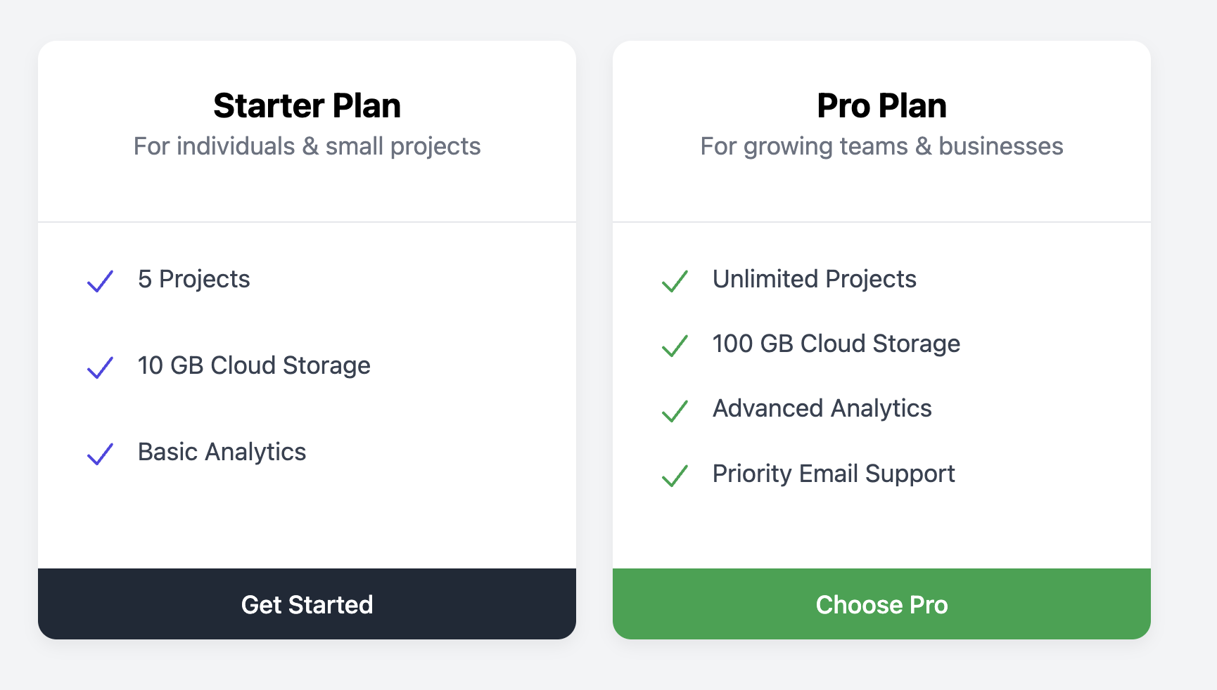
Summarize the key benefits or features of a product, plan, or service with this clear and scannable list card.
This component is a versatile pattern often used in pricing tables or to break down what's included in different subscription tiers. Each feature is presented as a list item, prefixed with a checkmark icon for positive reinforcement.
About this Component
The card is structured with a distinct header for the plan or product name, a main body containing a list of features, and a footer with a prominent call-to-action button. This vertical layout ensures that the card can accommodate lists of varying lengths while maintaining a clean appearance.
Features
- Bulleted List Format: Uses an unordered list (
ul) to present features, which is ideal for scannability and accessibility. - Iconography: Each feature is prefixed with a checkmark icon to visually reinforce it as a positive benefit.
- Color Theming: The icon and button colors can be easily themed with a single CSS variable. The example includes modifier classes to demonstrate this.
- Flexible Height: The card's layout is managed with Flexbox, allowing the feature list to expand as needed while keeping the footer perfectly aligned at the bottom.
Code Breakdown
HTML Structure
Each card is an article element. The content is divided into three semantic sections. These include a header for the title, a ul for the main features list, and a footer for the call-to-action button. Each feature is a list item (li) that contains an SVG icon and a span for the text.
CSS Styling
The main card (.fl-card) is a flex container with flex-direction: column. The flexible layout is achieved with the features list (.fl-features-list), which is given flex-grow: 1. This property makes the list expand to fill any available vertical space within the card, pushing the footer neatly to the bottom. This ensures that even when cards in a row have lists of different lengths, their footers and buttons will remain horizontally aligned.
Code
Here is the complete, self-contained code. You can easily customize the card by editing the text and adding or removing items from the feature list.