Background Gradient with Centered Text
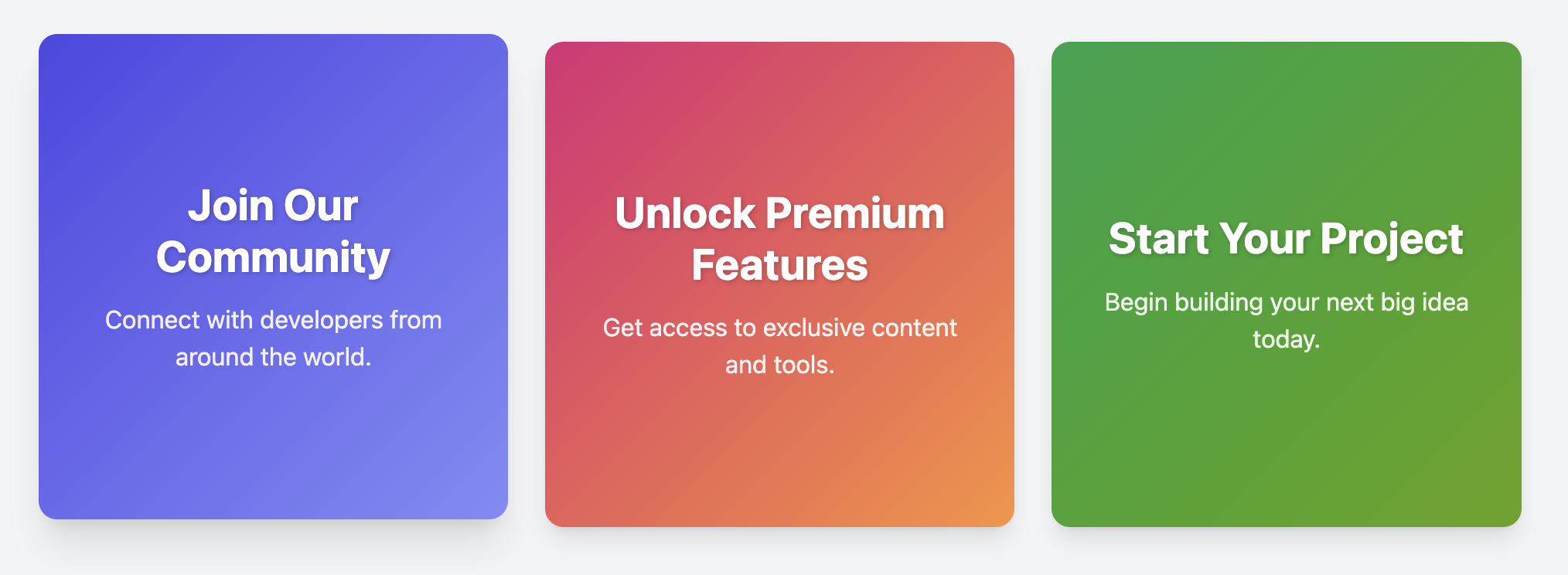
Create vibrant, attention-grabbing callouts or highlights with this card template featuring a full-bleed gradient background and perfectly centered text.
About this Component
This card template is designed to make a statement. By forgoing images in favor of bold colors and typography, it serves as an excellent component for primary calls-to-action or for highlighting important messages on a page. The template uses modern CSS for both the gradient effect and for centering the content.
Features
- CSS Gradients: The background is created using the
linear-gradient()function, which is lightweight and highly customizable. - Effortless Centering: Content is perfectly centered both vertically and horizontally using Flexbox properties.
- Easy Theming: The gradient colors are controlled by CSS variables, allowing you to create new themes simply by defining a new class that overrides the default colors.
- Responsive Grid Layout: Includes the standard responsive grid container for arranging multiple cards in a clean layout.
Code Breakdown
HTML Structure
The HTML for each card is extremely simple, consisting of a single div with the class .bgc-card. Inside, a h3 and a p tag hold the content. You can make the entire card a link by wrapping it in an a tag.
CSS Styling
The visual appeal comes from two core CSS techniques. First, the gradient background is applied by using a linear-gradient() as the background value. The colors for this function are stored in CSS variables (e.g., --bgc-gradient-start) to make changes easy. Second, the card's container is set to display: flex. This allows us to use justify-content: center to center the content on the vertical axis and align-items: center to center it on the horizontal axis, providing a robust centering solution with minimal code.
Code
Here is the complete code. You can easily change the gradient colors by editing the CSS variables within the .bgc-card rule, or by adding new modifier classes like the examples.