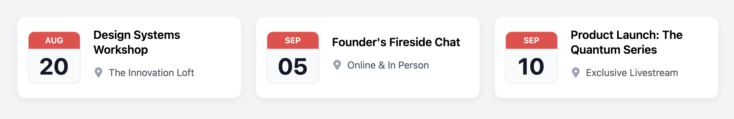
Calendar Date Card
Display event dates in a highly visual "desk calendar" style with this unique and scannable card component.
This layout gives prominence to the event date, making it a great choice for timelines, schedules, or "what's on" listings where the date is an important piece of information.
About this Component
This component features a prominent, self-contained date block that visually mimics a page from a tear-off calendar. The month is displayed in a colored banner for emphasis, while the day is a large, bold number. This date block is aligned horizontally with the event's title and other details.
Features
- High-Impact Date Display: The stylized date block makes event dates impossible to miss.
- Semantic Date Element: The entire date block is a single
timeelement with a machine-readabledatetimeattribute for excellent accessibility and SEO. - Flexbox Alignment: The component uses a simple Flexbox layout to keep the date block and the event details neatly aligned.
- Hover Effect: A subtle "lift" animation on hover provides clear interactive feedback.
Code Breakdown
HTML Structure
Each card is an article with the class .cal-card. For usability, the entire contents are wrapped in a single a tag, making the whole card a clickable link. The date block is a time element containing two span elements for the month and day. This is followed by a div that contains the rest of the event info.
CSS Styling
The main card is set to display: flex and align-items: center to vertically center its direct children (the date block and the info block). The date block itself is also a flex container, using flex-direction: column to stack the month and day vertically. Its distinct "calendar page" look is created with a light background color, a subtle border, and rounded corners.
Code
Here's the complete, self-contained code. You can easily adapt the template by changing the content and updating the datetime attribute for each event.