Styled Profile Completion Progress Card
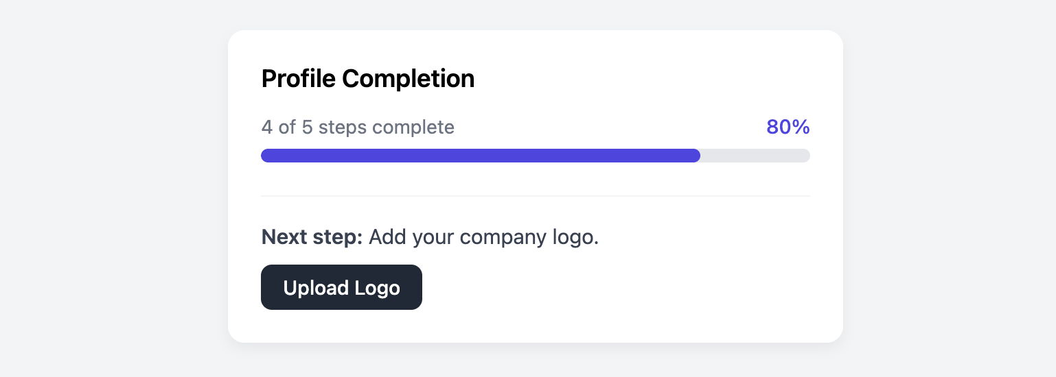
Encourage users to complete their profiles with this visually engaging and fully stylable progress card.
This progress card is built using div elements to give you maximum control over the progress bar's appearance, ensuring it looks identical across all browsers.
About this Component
This card uses styled div elements to create a progress bar, offering a solution for designers who need full, cross-browser control over the appearance, including details like the border-radius. To ensure it remains completely accessible, it uses ARIA attributes to describe its role and state to assistive technologies.
Features
- Full Cross-Browser Style Control: By using
divs instead of theprogresselement (which is a semantic element for displaying progress bars), the styles for colors, borders, and animations should look exactly the same in all modern browsers. - Accessible with ARIA: Uses
role="progressbar"and the relevantaria-attributes (aria-valuenow,aria-valuemin,aria-valuemax) to communicate its status to assistive technologies, making it fully accessible. - Clear Call-to-Action: A distinct footer section tells the user exactly what their next step is and provides a link to complete it.
The div vs. progress Approach
While HTML provides a semantic progress element, it is notoriously difficult to style consistently. Each browser (Chrome, Firefox, Safari) uses its own set of special CSS pseudo-elements to control the look of the bar, making it very hard to achieve a uniform design. This card template uses div elements to bypass this problem, giving you complete control with standard CSS.
If you prefer to use the semantic progress element, check out the Semantic Progress Card.
Code Breakdown
HTML Structure
The card is a section element. Inside, the progress bar is made of two nested div elements. The outer div acts as the background "track" and includes the important ARIA attributes. The inner div is the colored bar that indicates the current progress.
CSS Styling
The outer container has a light gray background and rounded corners, with overflow: hidden. The inner "fill" element is then given a vibrant background color. Its width is set via an inline style attribute (e.g., style="width: 80%;"). Because of the parent's overflow: hidden, the fill bar appears to grow within the track while conforming to its rounded corners.
Code
Here's the complete code. To dynamically update the progress, you would programmatically change the width percentage in the inline style of the .pcp-progress-bar-fill element and update the aria-valuenow attribute to match.