Semantic Profile Completion Card
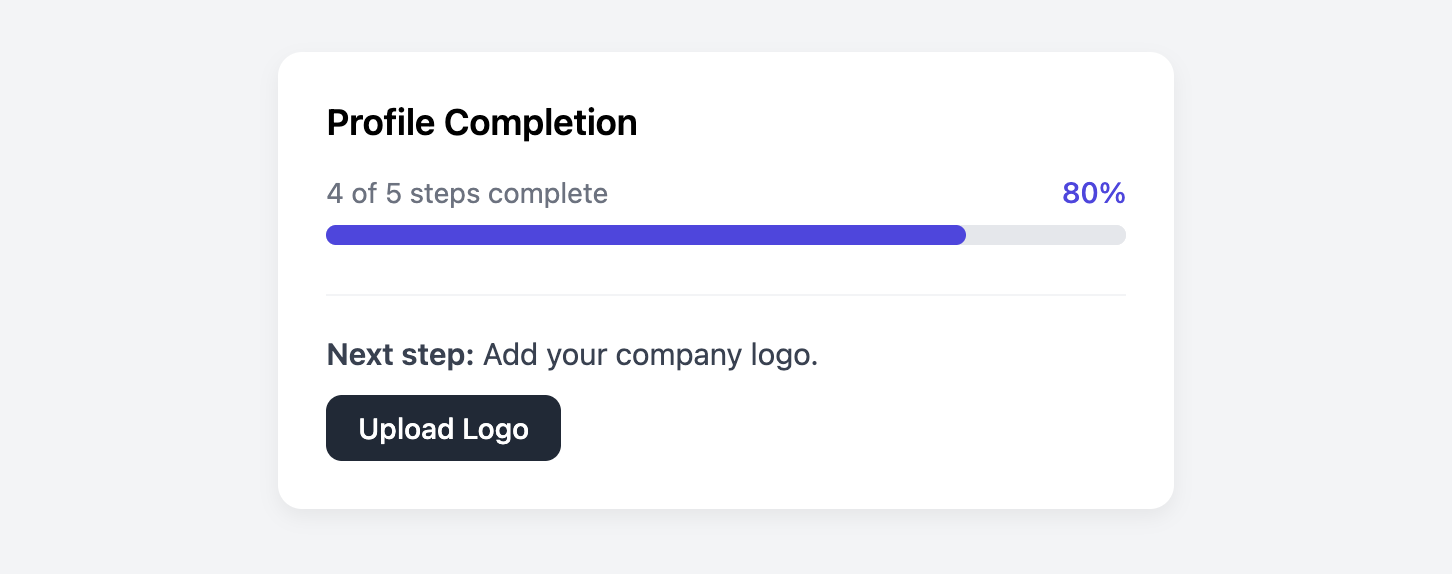
Encourage users to complete their profiles with this accessible and semantic progress card.
This version is built using the native HTML progress element, which is the most semantic and accessible way to represent progress to browsers and assistive technologies.
About this Component
The core of this card is the HTML progress element. It provides built-in accessibility for screen readers and a semantic understanding of the component's purpose to the browser. The progress value is set directly in the HTML value attribute, making it easy to update dynamically.
Features
- Semantic by Default: Uses the correct HTML element for the job, providing the best possible accessibility and meaning.
- Browser-Native: As a native element, it has excellent performance and requires no complex ARIA roles to be understood by assistive tech.
- Clear Call-to-Action: A distinct footer section tells the user exactly what their next step is and provides a link to complete it.
The progress vs. div Approach
This template prioritizes semantic HTML. The primary trade-off is styling control. While this template includes browser-specific CSS to make the progress bar look consistent, you may notice small visual differences between browsers like Chrome, Firefox, and Safari. The progress element is notoriously difficult to style uniformly across browsers.
For designs that require pixel-perfect, cross-browser consistency, check out the Styled div Progress Card. This uses div tags instead of progress in order to provide more control over the styling.
Code Breakdown
HTML Structure
The card is a section element. Inside, the progress bar is a single progress element. Its value is set with the value attribute, and its maximum possible value is set with the max attribute. For older browsers that may not support the element, text inside the tag (e.g., 80%) can serve as a fallback.
CSS Styling
To style the native progress element, we first use appearance: none to remove the browser's default OS-level styling. After that, we must use browser-specific pseudo-elements to target the bar's "track" and "fill" components. For Chrome and Safari, we use ::-webkit-progress-bar for the track and ::-webkit-progress-value for the fill. For Firefox, we style the track on the progress element itself and use ::-moz-progress-bar for the fill.
Code
Here's the complete code. To dynamically update the progress, you would programmatically change the value attribute on the progress element.