System Alert/Warning Card
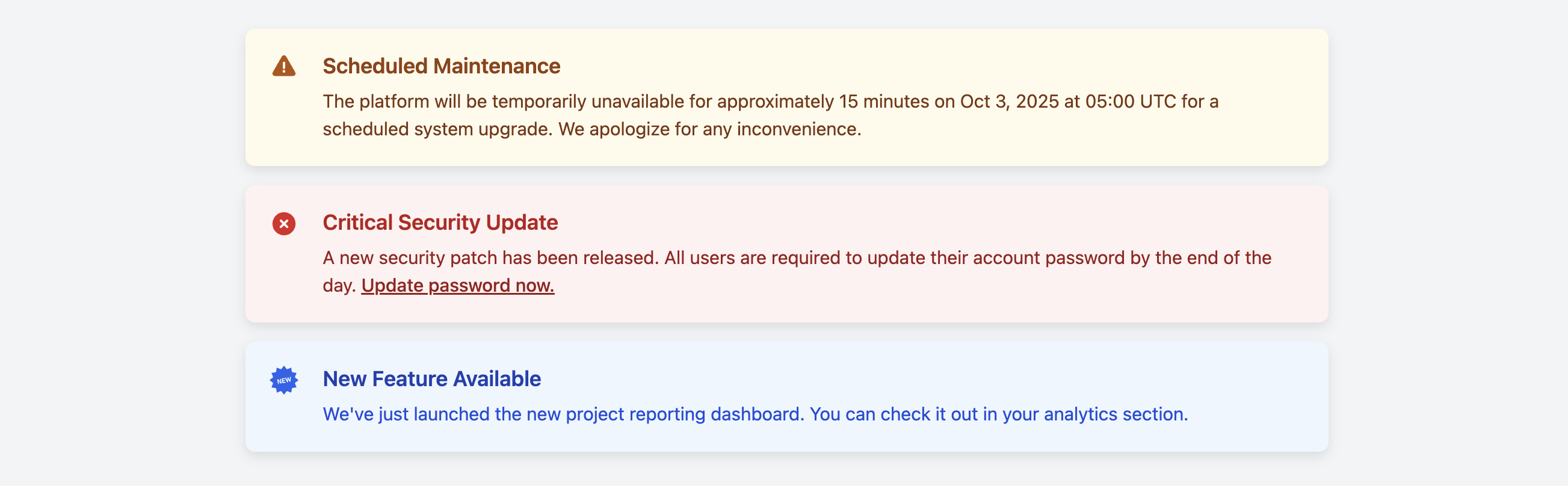
Communicate high-priority system-wide messages to users with this clear and prominent alert banner card.
This component is ideal for admin dashboards or application interfaces to notify users of critical information like scheduled maintenance, security updates, or major feature launches.
About this Component
This template is styled to be instantly recognizable as an important message. It uses a color-coded background, a matching accent border on the left, and a prominent icon to immediately convey the nature of the alert. The component is fully responsive and includes several color themes for different alert severities.
Features
- Contextual Color Themes: Includes pre-built, accessible themes for warnings (amber), info (blue), and danger (red).
- Theming with CSS Variables: All colors for each theme are controlled by a set of CSS variables, making it extremely easy to customize the look and feel or create new themes.
- Accessible: The card has a
role="alert"attribute to ensure that screen readers announce the message as an important update.
Code Breakdown
HTML Structure
Each alert is a div with the class .system-alert-card and an appropriate role attribute. You apply a modifier class, such as .is-danger, to change its appearance. Inside, a div holds the SVG icon, followed by another div for the textual content, which includes a h3 title and a p for the message.
CSS Styling
The card is a Flexbox container to align the icon and text content. The theming system is built entirely on CSS variables. The base .system-alert-card rule defines a default set of variables (e.g., --alert-bg-color, --alert-accent-color, etc.). Each modifier class, like .is-danger, simply overrides these variables with new color values. All other styles, like the border-left or the text color, inherit from these variables, allowing the entire component's color scheme to be changed with just a few lines of CSS.
Code
Here's the complete, self-contained code. To change the alert type, simply apply the desired modifier class to the main div element.