Author & Article Summary Card
Feature your authors prominently alongside their work with this two-column summary card.
This layout is designed for content platforms where the author's identity is a special feature. By placing the author in a dedicated column, it gives them more weight than a standard byline. Perfect for building author credibility and recognition.
About this Component
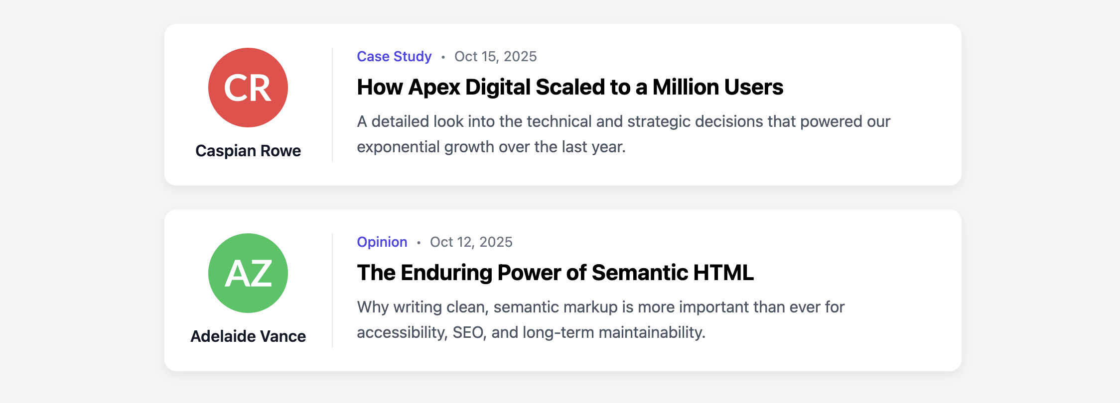
The card uses a horizontal, two-column layout on desktop, clearly separating the author's information from the article's summary. A subtle vertical border reinforces this separation. On mobile devices, the layout responsively stacks, placing the author's details above the article content in a format that remains clean and readable.
Features
- Author-Forward Design: The dedicated author column puts the writer front and center.
- Responsive Stacking: The horizontal layout intelligently switches to a stacked vertical layout on smaller screens to ensure an optimal reading experience everywhere.
- Clickable Wrapper: The entire card is wrapped in a single anchor tag, providing a large, user-friendly click target that directs to the full article.
- Semantic Structure: Uses an
articlecontainer and atimeelement for proper document structure.
Code Breakdown
HTML Structure
The entire card is an article. A single a tag wraps two child div elements for the author column (.aas-card-author-col) and the article column (.aas-card-article-col). For accessibility, the main link uses aria-labelledby to reference the id of the article title.
CSS Styling
The two-column layout is created by setting display: flex on the card's main anchor tag (.aas-card-link). The author column is given a fixed width and prevented from shrinking with flex-shrink: 0. The article column uses flex-grow: 1 to fill the remaining horizontal space.
A media query checks for screens narrower than 640px and changes the flex-direction of the main link to column. This is what causes the two columns to stack vertically. The styling for the author column is also adjusted within the media query to create a horizontal byline on mobile.
Code
Here is the complete code. This component is ready to be used in a list to build a main blog or articles page for a multi-author website.