CSS grid-template-rows
The CSS grid-template-rows property specifies the line names and track sizing functions of a grid's rows.
If your browser supports CSS grids, the above example should look like this:
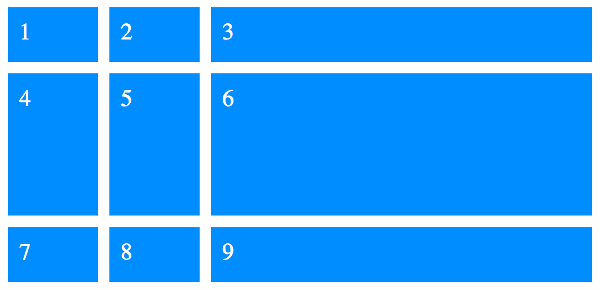
Here's an explanation of how grid-template-rows is used in the above example.
In this example we supply three values to the grid-template-row property. These three values specify the track sizing function to be used for each of the three rows. If we increased say, the first value, the first row would become taller.
In this particular example we provide sizes using two different units. The 20vh value is a type of length (each vh is relative to 1% of the viewport's height). The fr unit represents a flexible length (also known as a flex value). This unit represents a fraction of the free space in the grid container.
Named Lines
You can also modify the above example to use named lines, like this:
Named lines can make the grid easier to understand, as you can provide meaningful names to all of the lines in the grid.
So we could've created more meaningful names such as:
Named lines can be either explicit or implicit.
-
Explicit named lines are where you provide the names. These can be specified as part of the
grid-template-rowsandgrid-template-columnsproperties (as well as thegrid-templateandgridshorthand properties). -
Implicit named lines are names that are automatically created from the
grid-template-areasproperty. These named lines are created from the named grid areas in the template.For each named grid area named foo, four implicit named lines are created. Two named
foo-startname the row-start and column-start lines of the named grid area, and two namedfoo-endname the row-end and column-end lines of the named grid area.
Named lines are specified using a custom-ident value (a user defined identifier).
Syntax
Here's the official syntax of the grid-template-rows property:
Where
Possible Values
none- Specifies that no explicit grid tracks are created by this property (however, explicit grid tracks could still be created by the
grid-template-areasproperty). - track-list / auto-track-list
-
Specifies the track list as a series of track sizing functions and line names. These can be specified using the track-list syntax listed above.
Here's an explanation of the values listed in that syntax:
- length-percentage
-
This can be a non-negative length or percentage value.
Percentage values are relative to the inline size of the grid container in column grid tracks, and the block size of the grid container in row grid tracks. If the size of the grid container depends on the size of its tracks, then the percentage value is treated as
auto. - flex
-
This is a non-negative dimension with the unit
frspecifying the track's flex factor. Thefrunit represents a fraction of the free space in the grid container. Each flex-sized track takes a share of the remaining space in proportion to its flex factor. max-content-
Represents the largest max-content contribution of the grid items occupying the grid track.
min-content-
Represents the largest min-content contribution of the grid items occupying the grid track.
minmax(min, max)-
Defines a size range greater than or equal to min and less than or equal to max.
auto-
As a maximum, this is identical to
max-content. As a minimum, represents the largest minimum size (as specified bymin-width/min-height) of the grid items occupying the grid track. fit-content( length-percentage )-
Represents the formula
min(max-content, max(auto, argument)), which is calculated similar to auto (i.e.minmax(auto, max-content)), except that the track size is clamped at argument if it is greater than theautominimum.
In addition, all CSS properties also accept the following CSS-wide keyword values as the sole component of their property value:
initial- Represents the value specified as the property's initial value.
inherit- Represents the computed value of the property on the element's parent.
unset- This value acts as either
inheritorinitial, depending on whether the property is inherited or not. In other words, it sets all properties to their parent value if they are inheritable or to their initial value if not inheritable.
Basic Property Information
- Initial Value
none- Applies To
- Grid containers
- Inherited?
- No
- Media
- Visual
- Animation type
- As a simple list of length, percentage, or calc, provided the only differences are the values of the length, percentage, or calc components in the list (see example)
CSS Specifications
- The
grid-template-rowsproperty is defined in CSS Grid Layout Module Level 1 (W3C Candidate Recommendation, 9 February 2017).
Browser Support
The following table provided by Caniuse.com shows the level of browser support for this feature.
Vendor Prefixes
For maximum browser compatibility many web developers add browser-specific properties by using extensions such as -webkit- for Safari, Google Chrome, and Opera (newer versions), -ms- for Internet Explorer, -moz- for Firefox, -o- for older versions of Opera etc. As with any CSS property, if a browser doesn't support a proprietary extension, it will simply ignore it.
This practice is not recommended by the W3C, however in many cases, the only way you can test a property is to include the CSS extension that is compatible with your browser.
The major browser manufacturers generally strive to adhere to the W3C specifications, and when they support a non-prefixed property, they typically remove the prefixed version. Also, W3C advises vendors to remove their prefixes for properties that reach Candidate Recommendation status.
Many developers use Autoprefixer, which is a postprocessor for CSS. Autoprefixer automatically adds vendor prefixes to your CSS so that you don't need to. It also removes old, unnecessary prefixes from your CSS.
You can also use Autoprefixer with preprocessors such as Less and Sass.