
CSS transition-timing-function
The CSS transition-timing-function property allows you to specify how a transition will change speed throughout its duration. This effect is applied by using one of the timing functions described in CSS.
The transition-timing-function is specified using a cubic bézier curve, which is defined by four control points; P0, P1, P2, and P3. The points P0 and P3, which represent the start and end of the transition cycle, are always set to (0,0) and (1,1) repectively.
The transition-timing-function property includes a number of keywords that can be used as a quick way to get a nice transition. Alternatively, you can use the cubic-bezier() function to specify your own cubic Bézier curve.
Syntax
Where <easing-function> is defined as:
Possible Values
- ease
- The ease function is equivalent to
cubic-bezier(0.25, 0.1, 0.25, 1.0). - linear
- The linear function is equivalent to
cubic-bezier(0.0, 0.0, 1.0, 1.0). - ease-in
- The ease-in function is equivalent to
cubic-bezier(0.42, 0, 1.0, 1.0). - ease-out
- The ease-out function is equivalent to
cubic-bezier(0, 0, 0.58, 1.0). - ease-in-out
- The ease-in-out function is equivalent to
cubic-bezier(0.42, 0, 0.58, 1.0). cubic-bezier()- Specifies a cubic Bézier curve. The four values specify points P1 and P2 of the curve as (x1, y1, x2, y2). Both x values must be in the range [0, 1], but the y values can exceed that range.
- step-start
- Represents the timing function
steps(1, start). This keyword specifies that the animation will jump immediately to the end state and stay in that position until the end of the animation. - step-end
- Represents the timing function
steps(1, end). The animation stays in its initial state until the end, where it directly jumps to its final position. - steps(
[, [ start | end | jump-start | jump-end | jump-none | jump-both ] ]?) - Positive integer representing the amount of equidistant treads composing the stepping function. For example,
steps(5, end)indicates that there are 5 treads, with the last one occuring right before the end of the animation. The second parameter specifies the point at which the change of values occur.
In addition, all CSS properties also accept the following CSS-wide keyword values as the sole component of their property value:
initial- Represents the value specified as the property's initial value.
inherit- Represents the computed value of the property on the element's parent.
unset- This value acts as either
inheritorinitial, depending on whether the property is inherited or not. In other words, it sets all properties to their parent value if they are inheritable or to their initial value if not inheritable.
Cubic Bézier Curves
The ease, ease-in, ease-out, ease-in-out, linear, and cubic-bezier() timing functions use a Bézier curve.
A cubic Bézier curve is defined by four control points, P0, P1, P2, and P3 as shown in the following diagram.
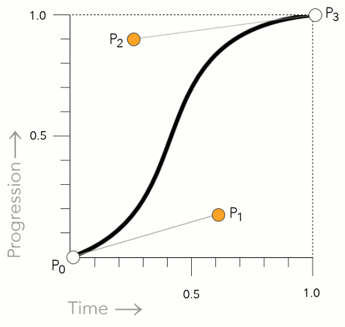
The P0 and P3 control points are always set to (0,0) and (1,1). In other words, they don't move.
However, P1 and P2 can be moved with the Bézier curve timing functions. When using the cubic-bezier() function, you can specify the location of these two control points by using an x and y value. Like this: x1, y1, x2, y2. When using one of the keywords, the keyword uses a predefined set of values (as listed above).
Step Timing Functions
The step-end, step-start, and steps() functions are all step timing functions. The way these work is that they progress the animation in steps — as opposed to a smooth curve like the Bézier curve functions.
Here's more detail on how they work.
Using the step-end Keyword
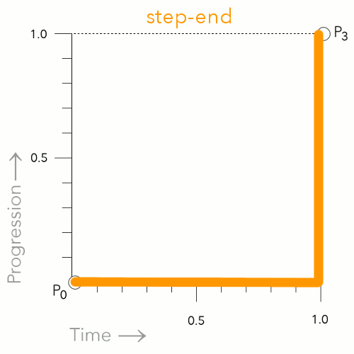
The step-end keyword causes the animation to remain in the start position until the very end. At first, this may appear as though the animation isn't actually working, as the effect won't happen until the end.
Using the step-start Keyword
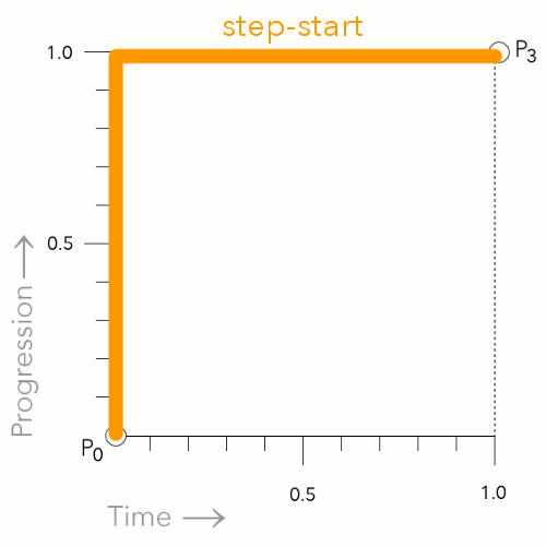
The step-start keyword causes the animation to jump straight to the end position, then remain there until the end of the animation.
Using the steps() Function
steps(5, end)
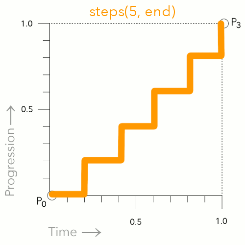
This is an example of using steps(5, end).This breaks the animation up into 5 distinct points. The animation waits, then jumps to the next point at the applicable time (which is determined by how many steps you specify).
steps(5, start)
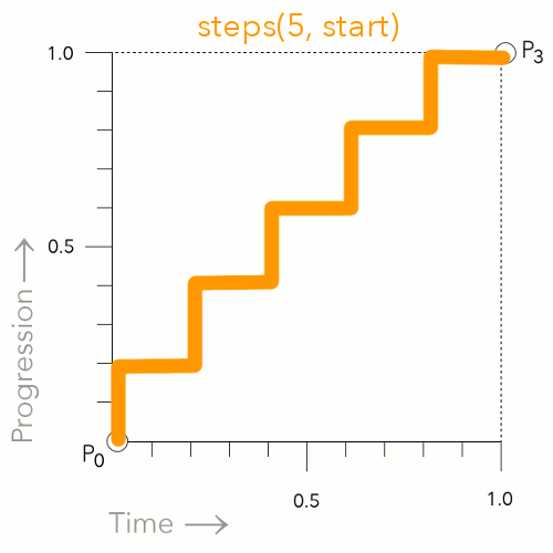
This is an example of using steps(5, start). This is similar to steps(5, end), however, it jumps to the first step immediately instead of waiting for the first time increment.
Basic Property Information
- Initial Value
ease- Applies To
- All elements, and the
:beforeand:afterpseudo elements - Inherited?
- No
- Media
- Interactive
Example Code
Basic CSS
Working Example within an HTML Document
CSS Specifications
- The
transition-timing-functionproperty is defined in CSS Transitions Level 1. - The easing functions themselves are defined in CSS Easing Functions Level 1.
Browser Support
Browser support for CSS properties can vary, particularly for newer or experimental features. Check current browser compatibility before using a property in production, especially when supporting older browsers.
The following table provided by Caniuse.com shows the level of browser support for this feature.
Initial Value
CSS properties have an initial value that applies when the property has not been explicitly set. The initial value is different from the value inherited from a parent element and may vary between properties.
Inheritance
Some CSS properties inherit their computed value from their parent element by default, while others do not. The inherit, initial, unset, and revert keywords can also be used to control how a property gets its value.
Vendor Prefixes
Most modern CSS properties use the standard, unprefixed syntax. Vendor-prefixed properties such as -webkit- are mainly relevant to older browser versions or specific features and should only be used when required by your browser support targets.