CSS cubic-bezier() Function
The cubic-bezier() function is used in CSS transitions to create a custom cubic Bézier curve.
The cubic-bezier() function can be used with the transition-timing-function property to control how a transition will change speed over its duration. This property accepts an easing function which describes how the intermediate values used during a transition will be calculated.
The cubic-bezier() function is one of the many possible easing functions that you can provide as a value for the transition-timing-function property.
Some of the other easing functions include ease-in, ease-out, linear etc. These use preset curves to determine how the transition progresses. However, the cubic-bezier() function can be used to provide your own custom curve.
How to use the cubic-bezier() Function
A cubic Bézier curve is defined by four control points, P0, P1, P2, and P3 as shown in the following diagram.
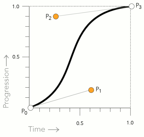
The P0 and P3 control points are always set to (0,0) and (1,1). In other words, they don't move.
However, P1 and P2 can be moved with the cubic-bezier() function. You can specify the location of these two control points by using an x and y value. Like this: x1, y1, x2, y2.
You specify these control points with number values. So an example might look like this:
This example sets the x and y values as follows:
Working Example
Here's a working example of how the cubic-bezier() function works. Hover over the ease element, then the cubic-bezier() element to see how a different Bézier curve changes the transition.
Notice in this case, the y2 value is higher than 1. This results in a kind of "bouncing" effect, where the transition zooms past its end point, then returns back to it. Almost like a rubber band being stretched then returning to its normal state. This is perfectly acceptable. Both y values can exceed the [0,1] range, however, the x values must be within the [0,1] range.
You might also notice that this example uses the transition shorthand property, which allows us to set multiple properties at once (including the transition-timing-function property).
Comparison with other Timing Functions
As mentioned, some of the other timing functions use preset curves to determine the transition's progress. Here are the values they use:
ease- Equivalent to
cubic-bezier(0.25, 0.1, 0.25, 1). linear- This function is equivalent to
cubic-bezier(0, 0, 1, 1). ease-in- This function is equivalent to
cubic-bezier(0.42, 0, 1, 1). ease-out- This function is equivalent to
cubic-bezier(0, 0, 0.58, 1). ease-in-out- This function is equivalent to
cubic-bezier(0.42, 0, 0.58,

  1)
.
So in other words, the following two declarations are equivalent:
Official Syntax
The official syntax of the cubic-bezier() function is as follows:
As mentioned, the four values listed in the syntax specify points P1 and P2 of the curve as (x1, y1, x2, y2). Like this
Both x values must be number values in the range [0, 1]. The y values can exceed this range.
CSS Specifications
- The
cubic-bezier()function is defined in CSS Transitions (W3C Working Draft 19 November 2013)
Browser Support
The following table provided by Caniuse.com shows the level of browser support for this feature.