CSS grid-gap
Update
The CSS grid-gap property is now an alias for the gap property.
Use gap instead.
The remainder of this article outlines how this property worked before it was repurposed as an alias to gap.
Note that this was done in a backwards compatible way, so any legacy code shouldn't be impacted (i.e. any existing grid-gap code should remain working as expected).
The CSS grid-gap property is a shorthand property for setting the gutters between grid rows and columns.
If your browser supports CSS grids, the above example should look like this:
The grid-gap property is shorthand for the grid-column-gap and grid-row-gap properties. It's a convenient way to set the grid gutters, without having to write out each property name individually.
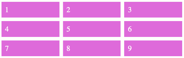
Here's how the grid the above example works.
So providing one value sets the gutter for both the rows and the columns.
If you provide two values, the first value sets the gutter for the rows, the second value sets it for the columns.
Like this:
Syntax
Here's the official syntax of the grid-gap property:
These values are explained below.
Possible Values
- 'grid-row-gap'
- This value sets the
grid-row-gapproperty. - 'grid-column-gap'
- This value sets the
grid-column-gapproperty.
Providing only one value applies the same gutter to both the row and the column. Negative values are invalid.
In addition, all CSS properties also accept the following CSS-wide keyword values as the sole component of their property value:
initial- Represents the value specified as the property's initial value.
inherit- Represents the computed value of the property on the element's parent.
unset- This value acts as either
inheritorinitial, depending on whether the property is inherited or not. In other words, it sets all properties to their parent value if they are inheritable or to their initial value if not inheritable.
Basic Property Information
- Initial Value
0 0- Applies To
- Grid containers
- Inherited?
- No
- Media
- Visual
- Animation type
- As length, percentage, or calc (see example)
CSS Specifications
- The
grid-gapproperty is defined in CSS Grid Layout Module Level 1 (W3C Candidate Recommendation, 9 February 2017).
Browser Support
The following table provided by Caniuse.com shows the level of browser support for this feature.
Vendor Prefixes
For maximum browser compatibility many web developers add browser-specific properties by using extensions such as -webkit- for Safari, Google Chrome, and Opera (newer versions), -ms- for Internet Explorer, -moz- for Firefox, -o- for older versions of Opera etc. As with any CSS property, if a browser doesn't support a proprietary extension, it will simply ignore it.
This practice is not recommended by the W3C, however in many cases, the only way you can test a property is to include the CSS extension that is compatible with your browser.
The major browser manufacturers generally strive to adhere to the W3C specifications, and when they support a non-prefixed property, they typically remove the prefixed version. Also, W3C advises vendors to remove their prefixes for properties that reach Candidate Recommendation status.
Many developers use Autoprefixer, which is a postprocessor for CSS. Autoprefixer automatically adds vendor prefixes to your CSS so that you don't need to. It also removes old, unnecessary prefixes from your CSS.
You can also use Autoprefixer with preprocessors such as Less and Sass.