
CSS grid-template
The CSS grid-template property is a shorthand property for setting the grid tracks and named grid areas.
If your browser supports CSS grids, the above example should look like this:
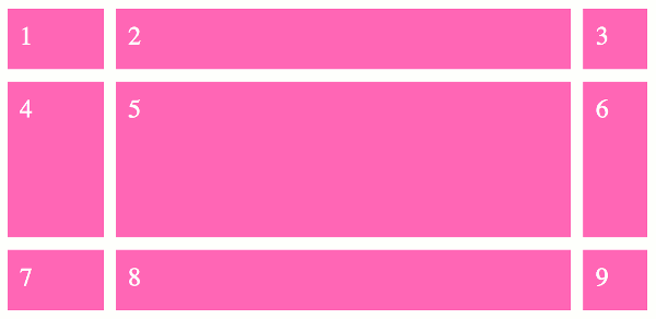
The grid-template property sets the grid-template-rows, grid-template-columns, and grid-template-areas properties. This can be a convenient way to set those properties without having to type out each property name.
Here's an explanation of how grid-template is used in the above example.
The grid-template property sets the rows and columns, separated by a forward slash. In this example the first row is 20vh, the second is 1fr, and the third is 20vh. The first column is 15vw, the second column is 1fr, and the third column is 10vw.
The vh and vw units are length units that represent 1% of the viewport's height (for vh) or width (for vw).
The fr unit represents a fraction of the free space in the grid container. It is referred to as a flexible length or simply flex.
Using the "ASCII art" Syntax
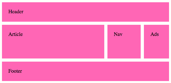
The grid-template-areas property allows you to define the template areas using a kind of "ASCII art" syntax. This makes it extremely easy to visualize your grid, as the ASCII art represents exactly how the grid is laid out.
Seeing as grid-template-areas is one of the properties covered by the grid-template property, you can provide the ASCII art straight to the grid-template property.
The way it works is, you create a text-based grid using named grid areas. If a grid area is wider or taller than others, you simply repeat that name across (or down) the grid.
The named grid areas are provided as a series of strings, each one representing a different row.
Like this:
Here's a working example:
The above code results in the following grid:
Named Lines
You can also modify the above example to use named lines, like this:
Named lines can make the grid easier to understand, as you can provide meaningful names to all of the lines in the grid.
Named lines can be either explicit or implicit.
-
Explicit named lines are where you provide the names. These can be specified as part of the
grid-template-rowsandgrid-template-columnsproperties (which are both covered by thegrid-templateshorthand property). -
Implicit named lines are names that are automatically created from the
grid-template-areasproperty. These named lines are created from the named grid areas in the template.For each named grid area named foo, four implicit named lines are created. Two named
foo-startname the row-start and column-start lines of the named grid area, and two namedfoo-endname the row-end and column-end lines of the named grid area.
Named lines are specified using a custom-ident value (a user defined identifier).
Syntax
Here's the official syntax of the grid-template property:
Where
Possible Values
none- Sets all three properties to their initial values (
none). - 'grid-template-rows' / 'grid-template-columns'
-
Sets the
grid-template-rowsandgrid-template-columnsproperties to the specified values, and sets thegrid-template-areasproperty tonone. - [ line-names? string track-size? line-names? ]+ [ / explicit-track-list ]?
-
This syntax allows you to specify the line names, track sizes, and grid areas within the respective lines. Like this:
The line-names can be specified by using a custom-ident value.
The string specifies the named grid areas.
The track-size specifies the size of the track.
In addition, all CSS properties also accept the following CSS-wide keyword values as the sole component of their property value:
initial- Represents the value specified as the property's initial value.
inherit- Represents the computed value of the property on the element's parent.
unset- This value acts as either
inheritorinitial, depending on whether the property is inherited or not. In other words, it sets all properties to their parent value if they are inheritable or to their initial value if not inheritable.
Basic Property Information
- Initial Value
- As each of the properties of the shorthand. These are:
grid-template-rows:nonegrid-template-columns:nonegrid-template-areas:none
- Applies To
- Grid containers
- Inherited?
- No (i.e. none of the shorthand properties are inherited)
- Media
- Visual
- Animation type
- Discrete (see example)
CSS Specifications
- The
grid-templateproperty is defined in CSS Grid Layout Module Level 2.
Browser Support
Browser support for CSS properties can vary, particularly for newer or experimental features. Check current browser compatibility before using a property in production, especially when supporting older browsers.
The following table provided by Caniuse.com shows the level of browser support for this feature.
Initial Value
CSS properties have an initial value that applies when the property has not been explicitly set. The initial value is different from the value inherited from a parent element and may vary between properties.
Inheritance
Some CSS properties inherit their computed value from their parent element by default, while others do not. The inherit, initial, unset, and revert keywords can also be used to control how a property gets its value.
Vendor Prefixes
Most modern CSS properties use the standard, unprefixed syntax. Vendor-prefixed properties such as -webkit- are mainly relevant to older browser versions or specific features and should only be used when required by your browser support targets.