CSS grid-auto-rows
The CSS grid-auto-rows property specifies the line names and track sizing functions of a grid's implicitly created rows.
If your browser supports CSS grids, the above example should look like this:
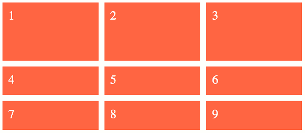
The grid-auto-rows property only deals with rows that are created implicitly. These are the rows that haven't been explicitly sized with the grid-template-rows property.
If we examine the code from the above example:
We can see that only the first row was explicitly sized with the grid-template-rows property. The other two rows were created implicitly, and therefore they are sized according to the grid-auto-rows property.
The result is that the first row is 40vh and the other rows are 20vh.
Multiple Values
The grid-auto-rows property accepts multiple values. Here's an example:
Syntax
Here's the official syntax of the grid-auto-rows property:
Where
Possible Values
- length-percentage
-
This can be a non-negative length or percentage value.
Percentage values are relative to the inline size of the grid container in column grid tracks, and the block size of the grid container in row grid tracks. If the size of the grid container depends on the size of its tracks, then the percentage value is treated as
auto. - flex
-
This is a non-negative dimension with the unit
frspecifying the track's flex factor. Thefrunit represents a fraction of the free space in the grid container. Each flex-sized track takes a share of the remaining space in proportion to its flex factor. max-content-
Represents the largest max-content contribution of the grid items occupying the grid track.
min-content-
Represents the largest min-content contribution of the grid items occupying the grid track.
minmax(min, max)-
Defines a size range greater than or equal to min and less than or equal to max.
auto-
As a maximum, this is identical to
max-content. As a minimum, represents the largest minimum size (as specified bymin-width/min-height) of the grid items occupying the grid track. fit-content( length-percentage )-
Represents the formula
min(max-content, max(auto, argument)), which is calculated similar to auto (i.e.minmax(auto, max-content)), except that the track size is clamped at argument if it is greater than theautominimum.
In addition, all CSS properties also accept the following CSS-wide keyword values as the sole component of their property value:
initial- Represents the value specified as the property's initial value.
inherit- Represents the computed value of the property on the element's parent.
unset- This value acts as either
inheritorinitial, depending on whether the property is inherited or not. In other words, it sets all properties to their parent value if they are inheritable or to their initial value if not inheritable.
Basic Property Information
- Initial Value
auto- Applies To
- Grid containers
- Inherited?
- No
- Media
- Visual
- Animation type
- Discrete (see example)
CSS Specifications
- The
grid-auto-rowsproperty is defined in CSS Grid Layout Module Level 1 (W3C Candidate Recommendation, 9 February 2017).
Browser Support
The following table provided by Caniuse.com shows the level of browser support for this feature.
Vendor Prefixes
For maximum browser compatibility many web developers add browser-specific properties by using extensions such as -webkit- for Safari, Google Chrome, and Opera (newer versions), -ms- for Internet Explorer, -moz- for Firefox, -o- for older versions of Opera etc. As with any CSS property, if a browser doesn't support a proprietary extension, it will simply ignore it.
This practice is not recommended by the W3C, however in many cases, the only way you can test a property is to include the CSS extension that is compatible with your browser.
The major browser manufacturers generally strive to adhere to the W3C specifications, and when they support a non-prefixed property, they typically remove the prefixed version. Also, W3C advises vendors to remove their prefixes for properties that reach Candidate Recommendation status.
Many developers use Autoprefixer, which is a postprocessor for CSS. Autoprefixer automatically adds vendor prefixes to your CSS so that you don't need to. It also removes old, unnecessary prefixes from your CSS.
You can also use Autoprefixer with preprocessors such as Less and Sass.