CSS grid-column-start
The CSS grid-column-start property is used for line-based placement of grid items along a column's start line.
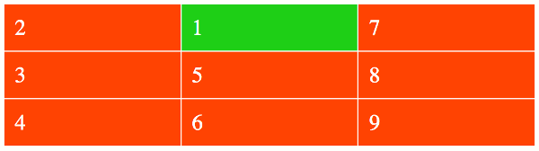
If your browser supports CSS grids, the above example should look like this:
The grid-column-start property allows you to specify which line a grid item starts on, and how many tracks it spans.
Let's look at the relevant code from the above example:
This results in the first grid item being moved to column 2.
To be more precise, the number 2 actually refers to the grid line. So the grid item starts at grid line 2.
Named Grid Areas
You can also refer to any named grid areas that you've created with the grid-template-areas property:
Implicit Named Lines
You can also refer to any implicit (and explicit) named lines that have been defined on the grid.
Implicit named lines are created automatically whenever you create a named grid area. So whenever you create a named grid area (like in the previous example), a whole set of implicit named lines are created behind the scenes.
For each named grid area named foo, four implicit named lines are created. Two named foo-start name the row-start and column-start lines of the named grid area, and two named foo-end name the row-end and column-end lines of the named grid area.
So we can take the above example, and append -start to b and we'll now be referring to the implicit named line:
So, we didn't actually define b-start anywhere in the code. This was automatically generated from our named grid area. If we'd called the grid area say, bob, our implicit named line would be called bob-start.
Explicit Named Lines
CSS also allows you to specify your own names for the grid lines. These are referred to as explicit named lines.
You can create these names when you define the tracks, then refer to them just like with the implicit named lines:
The span Keyword
The span keyword can be used to make a grid item span multiple tracks.
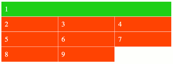
Here's an example:
Here's how that should look in the browser:
Syntax
Here's the official syntax of the grid-column-start property:
Where:
Possible Values
auto-
Specifies that this property contributes nothing to the grid item's placement, indicating auto-placement or a default span of
1. - custom-ident
-
The custom-ident value specifies a named grid area. The first named line with the name
custom-ident-startcontributes to the grid item's placement.If there are no such named lines, it behaves as though the integer
1had been specified along with the custom-ident. - integer && custom-ident?
-
Contributes the Nth grid line to the grid item's placement. If a negative integer is given, it instead counts in reverse, starting from the end edge of the explicit grid.
If a name is given as a custom-ident, only lines with that name are counted. If not enough lines with that name exist, all implicit grid lines are assumed to have that name for the purpose of finding this position.
An integer value of zero makes the declaration invalid.
span&& [ integer || custom-ident ]-
Contributes a grid span to the grid item's placement such that the corresponding edge of the grid item's grid area is N lines from its opposite edge in the corresponding direction.
For example,
grid-column-end: span 2indicates the second grid line in the endward direction from thegrid-column-startline.If a name is given as a custom-ident, only lines with that name are counted. If not enough lines with that name exist, all implicit grid lines on the side of the explicit grid corresponding to the search direction are assumed to have that name for the purpose of counting this span.
In addition, all CSS properties also accept the following CSS-wide keyword values as the sole component of their property value:
initial- Represents the value specified as the property's initial value.
inherit- Represents the computed value of the property on the element's parent.
unset- This value acts as either
inheritorinitial, depending on whether the property is inherited or not. In other words, it sets all properties to their parent value if they are inheritable or to their initial value if not inheritable.
Basic Property Information
- Initial Value
auto- Applies To
- Grid items and absolutely-positioned boxes whose containing block is a grid container
- Inherited?
- No
- Media
- Visual
- Animation type
- Discrete (see example)
CSS Specifications
- The
grid-column-startproperty is defined in CSS Grid Layout Module Level 1 (W3C Candidate Recommendation, 9 February 2017).
Browser Support
The following table provided by Caniuse.com shows the level of browser support for this feature.
Vendor Prefixes
For maximum browser compatibility many web developers add browser-specific properties by using extensions such as -webkit- for Safari, Google Chrome, and Opera (newer versions), -ms- for Internet Explorer, -moz- for Firefox, -o- for older versions of Opera etc. As with any CSS property, if a browser doesn't support a proprietary extension, it will simply ignore it.
This practice is not recommended by the W3C, however in many cases, the only way you can test a property is to include the CSS extension that is compatible with your browser.
The major browser manufacturers generally strive to adhere to the W3C specifications, and when they support a non-prefixed property, they typically remove the prefixed version. Also, W3C advises vendors to remove their prefixes for properties that reach Candidate Recommendation status.
Many developers use Autoprefixer, which is a postprocessor for CSS. Autoprefixer automatically adds vendor prefixes to your CSS so that you don't need to. It also removes old, unnecessary prefixes from your CSS.
You can also use Autoprefixer with preprocessors such as Less and Sass.