CSS grid-auto-flow
The CSS grid-auto-flow property specifies how auto-placed items get flowed into the grid.
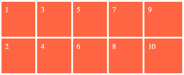
If your browser supports CSS grids, the above example should look like this:
The grid-auto-flow property only deals with grid items that are placed into tracks that are created implicitly. Grid items that aren't explicitly placed are automatically placed into unoccupied space, and an implicit grid is created just for that purpose. The grid-auto-flow property specifies exactly how these items are placed.
Let's look at the relevant code from the above example:
We define two rows, but we don't define any columns. Therefore the grid container will need to add columns implicitly in order to fit any grid items into the grid.
Normally when you do this, the grid container will add more rows to accomodate the grid items — not columns. The grid items will simply pile up on top of each other. This is because the intial value of the grid-auto-flow property is row. But in our example, we use grid-auto-flow: column to specify that grid items will be auto-placed into columns — not rows.
The dense Keyword
The dense keyword can come in handy if you have different sized grid items within an implicit grid, some of which span multiple tracks.
Normally, an implicit grid will simply list out the items in source order. If all grid items are the same size, and fit within a single track, this will typically result in an evenly spaced grid with the grid items packed up tight against each other (depending on gutters, alignment, etc).
But if some of the grid items span multiple tracks and others don't, you can end up with a grid where items flow over to the next line well before the end of the grid container, causing the grid to look a bit "jagged" on one side.
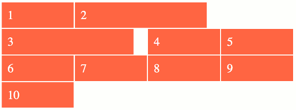
Without the dense keyword:
Here, grid items 2 and 3 both span two columns. This causes item 3 to wrap over to the next row, leaving a space on the end of the first row.
Here's how that should look in the browser:
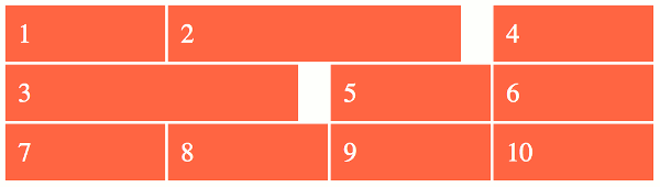
With the dense keyword:
Using the dense keyword causes item 4 to be moved up to the end of the first line so that it fills the space left behind by item 3.
Here's how that should look in the browser:
The dense keyword is an optional keyword that tells the browser to use a "dense" packing algorithm. What this means is that the browser will attempt to fill in holes earlier in the grid if smaller items come up later.
It's important to note that this can result in grid items appearing out of source order. You can see from the above example that grid item "4" comes before "3" once the dense keyword is used. This technique is usually fine when used on things where the visual order doesn't matter (like image galleries, etc), but it should be avoided if the visual order is important (such as on forms, etc).
Syntax
Here's the official syntax of the grid-auto-flow property:
These values are explained below.
Possible Values
row-
Specifies that new rows are added to fit any auto-placed items.
column-
Specifies that new columns are added to fit any auto-placed items.
dense-
Specifies that a "dense" packing algorithm is used, which attempts to fill in holes earlier in the grid if smaller items come up later.
If
denseisn't specified, then a "sparse" placement algorithm is used instead, where grid items are placed in source order (never backtracking to fill any holes).
In addition, all CSS properties also accept the following CSS-wide keyword values as the sole component of their property value:
initial- Represents the value specified as the property's initial value.
inherit- Represents the computed value of the property on the element's parent.
unset- This value acts as either
inheritorinitial, depending on whether the property is inherited or not. In other words, it sets all properties to their parent value if they are inheritable or to their initial value if not inheritable.
Basic Property Information
- Initial Value
row- Applies To
- Grid containers
- Inherited?
- No
- Media
- Visual
- Animation type
- Discrete (see example)
CSS Specifications
- The
grid-auto-flowproperty is defined in CSS Grid Layout Module Level 1 (W3C Candidate Recommendation, 9 February 2017).
Browser Support
The following table provided by Caniuse.com shows the level of browser support for this feature.
Vendor Prefixes
For maximum browser compatibility many web developers add browser-specific properties by using extensions such as -webkit- for Safari, Google Chrome, and Opera (newer versions), -ms- for Internet Explorer, -moz- for Firefox, -o- for older versions of Opera etc. As with any CSS property, if a browser doesn't support a proprietary extension, it will simply ignore it.
This practice is not recommended by the W3C, however in many cases, the only way you can test a property is to include the CSS extension that is compatible with your browser.
The major browser manufacturers generally strive to adhere to the W3C specifications, and when they support a non-prefixed property, they typically remove the prefixed version. Also, W3C advises vendors to remove their prefixes for properties that reach Candidate Recommendation status.
Many developers use Autoprefixer, which is a postprocessor for CSS. Autoprefixer automatically adds vendor prefixes to your CSS so that you don't need to. It also removes old, unnecessary prefixes from your CSS.
You can also use Autoprefixer with preprocessors such as Less and Sass.